Finance Data
“Data!data!data!” he cried impatiently. “I can’t make bricks without clay.”
–Arthur Conan Doyle, The Adventure of the Copper Beeches
The easiest way to download data is if someone makes available a CSV file and we can download it directly off the web with readr::read_csv()or with data.table::fread(). Alternatively, we can use the rio package to download many different types of files (Excel, SPSS, Stata, etc.)
In this section we will look at three packages that use wrapped Application Programming Interface (APIs) to get data off the web:
tidyquantto get finance data
wbstatsto get data from the World Bank database, andeurostatto get Eurostat data.
Finance data with the tidyquant package
The tidyquant package comes with a number of functions- utilities that allow us to download financial data off the web, as well as ways of handling all this data.
We begin by loading the data set into the R workspace. We create a collection of stocks with their ticker symbols and then use the piping operator %>% to use tidyquant’s tq_get to download historical data using Yahoo finance and, again, to group data by their ticker symbol.
library(tidyquant)
myStocks <- c("AAPL","JPM","DIS","DPZ","ANF","XOM","SPY" ) %>%
  tq_get(get  = "stock.prices",
         from = "2011-01-01",
         to   = "2021-07-31") %>%
  group_by(symbol)

glimpse(myStocks) # examine the structure of the resulting data frame
## Rows: 18,466
## Columns: 8
## Groups: symbol [7]
## $ symbol <chr> "AAPL", "AAPL", "AAPL", "AAPL", "AAPL", "AAPL", "AAPL", "AAPL~
## $ date <date> 2011-01-03, 2011-01-04, 2011-01-05, 2011-01-06, 2011-01-07, ~
## $ open <dbl> 11.6, 11.9, 11.8, 12.0, 11.9, 12.1, 12.3, 12.3, 12.3, 12.4, 1~
## $ high <dbl> 11.8, 11.9, 11.9, 12.0, 12.0, 12.3, 12.3, 12.3, 12.4, 12.4, 1~
## $ low <dbl> 11.6, 11.7, 11.8, 11.9, 11.9, 12.0, 12.1, 12.2, 12.3, 12.3, 1~
## $ close <dbl> 11.8, 11.8, 11.9, 11.9, 12.0, 12.2, 12.2, 12.3, 12.3, 12.4, 1~
## $ volume <dbl> 4.45e+08, 3.09e+08, 2.56e+08, 3.00e+08, 3.12e+08, 4.49e+08, 4~
## $ adjusted <dbl> 10.1, 10.2, 10.3, 10.2, 10.3, 10.5, 10.5, 10.6, 10.6, 10.7, 1~For each ticker symbol, the data frame contains its symbol, the date, the prices for open,high, low and close, and the volume, or how many stocks were traded on that day. More importantly, the data frame contains the adjusted closing price, which adjusts for any stock splits and/or dividends paid and this is what we will be using for our analyses.
Calculating financial returns
Financial performance and CAPM analysis depend on returns and not on adjusted closing prices. So given the adjusted closing prices, our first step is to calculate daily and monthly returns.
#calculate daily returns
myStocks_returns_daily <- myStocks %>%
  tq_transmute(select     = adjusted,
               mutate_fun = periodReturn,
               period     = "daily",
               type       = "log",
               col_rename = "daily.returns",
               cols = c(nested.col))

#calculate monthly  returns
myStocks_returns_monthly <- myStocks %>%
  tq_transmute(select     = adjusted,
               mutate_fun = periodReturn,
               period     = "monthly",
               type       = "arithmetic",
               col_rename = "monthly.returns",
               cols = c(nested.col))

#calculate yearly returns
myStocks_returns_annual <- myStocks %>%
  group_by(symbol) %>%
  tq_transmute(select     = adjusted,
               mutate_fun = periodReturn,
               period     = "yearly",
               type       = "arithmetic",
               col_rename = "yearly.returns",
               cols = c(nested.col))
For yearly and monthly data, we assume discrete changes, so we the formula used to calculate the return for month (t+1) is
\(Return(t+1)= \frac{Adj.Close(t+1)}{Adj.Close (t)}-1\)
For daily data we use log returns, or \(Return(t+1)= LN\frac{Adj.Close(t+1)}{Adj.Close (t)}\)
The reason we use log returns are:
Compound interest interpretation; namely, that the log return can be interpreted as the continuously (rather than discretely) compounded rate of return
Log returns are assumed to follow a normal distribution
Log return over n periods is the sum of n log returns
Summarising the data set
Let us get quick summary statistics of daily returns for each stock, as well as a density plot where we usefacet_grid to superimpose all the distributions in one plot.
| symbol | min | median | max | mean | sd | annual_mean | annual_sd |
|---|---|---|---|---|---|---|---|
| AAPL | -0.138 | 0.001 | 0.113 | 0.001 | 0.018 | 0.244 | 0.283 |
| ANF | -0.307 | 0.001 | 0.296 | 0.000 | 0.034 | 0.009 | 0.541 |
| DIS | -0.139 | 0.001 | 0.135 | 0.001 | 0.016 | 0.159 | 0.249 |
| DPZ | -0.106 | 0.001 | 0.228 | 0.001 | 0.018 | 0.332 | 0.283 |
| JPM | -0.162 | 0.001 | 0.166 | 0.001 | 0.018 | 0.147 | 0.284 |
| SPY | -0.116 | 0.001 | 0.087 | 0.001 | 0.011 | 0.134 | 0.170 |
| XOM | -0.130 | 0.000 | 0.119 | 0.000 | 0.016 | 0.025 | 0.247 |
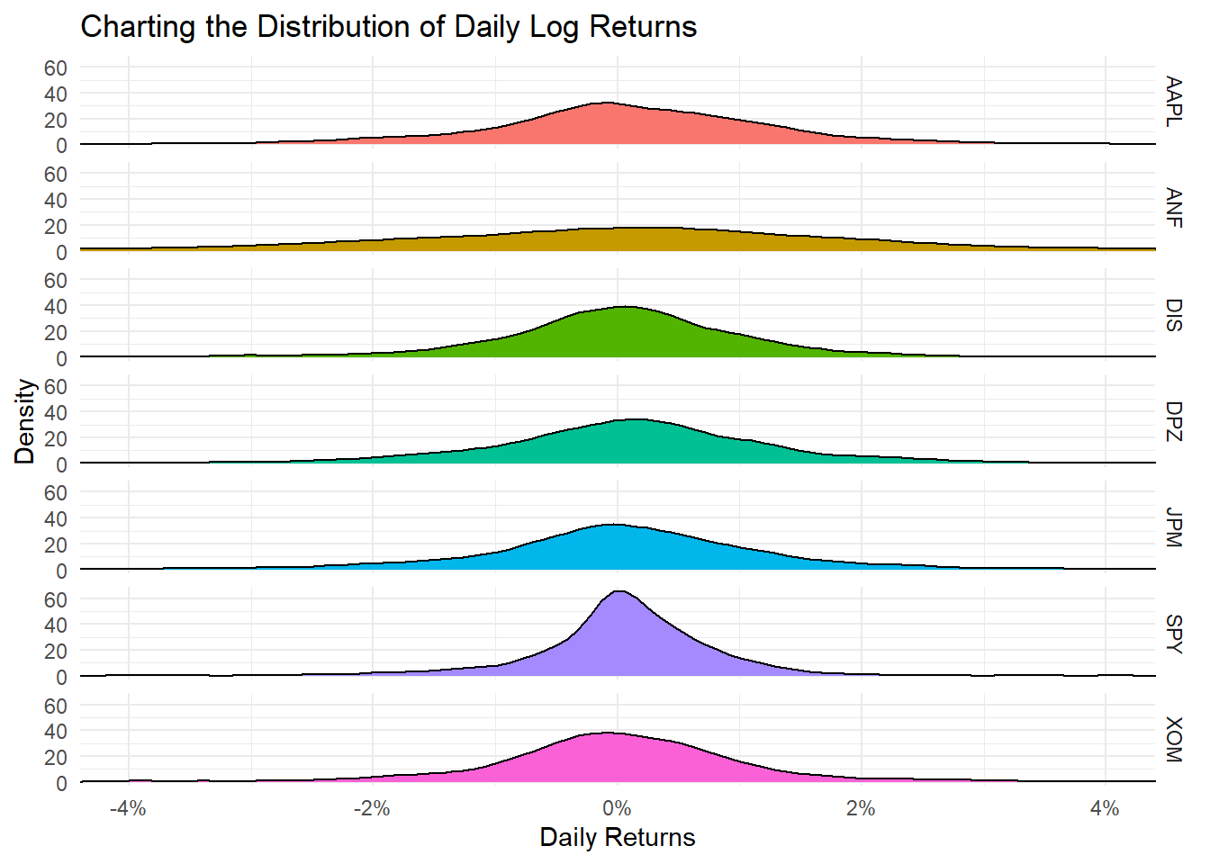
Daily returns seem to follow a normal distribution with a mean close to zero. Since most people think of returns on an annual, rather than on a daily basis, we can calculate summary statistics of annual returns, a boxplot of annual returns, and a bar plot that shows return for each stock on a year-by-year basis.
myStocks_returns_annual %>%
  group_by(symbol) %>%
  mutate(median_return= median(yearly.returns)) %>%

  # arrange stocks by median yearly return, so highest median return appears first, etc.
  ggplot(aes(x=reorder(symbol, median_return), y=yearly.returns, colour=symbol)) +
  geom_boxplot()+
  coord_flip()+
  labs(x="Stock",
       y="Returns",
       title = "Boxplot of Annual Returns")+
  scale_y_continuous(labels = scales::percent_format(accuracy = 2))+
  guides(color=FALSE) +
  theme_bw()+
  NULL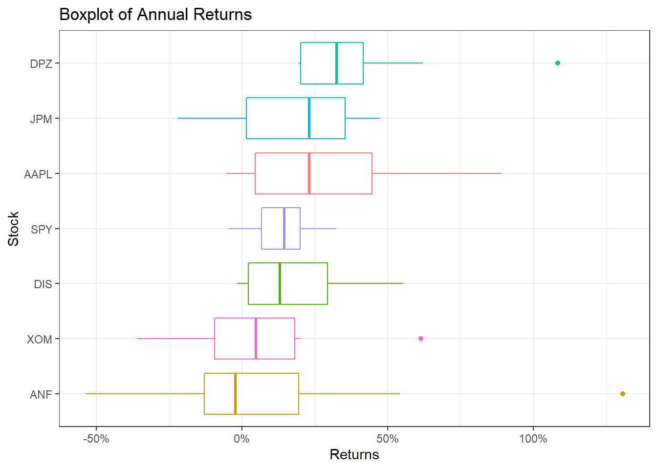
ggplot(myStocks_returns_annual, aes(x=year(date), y=yearly.returns, fill=symbol)) +
  geom_col(position = "dodge")+
  labs(x="Year", y="Returns", title = "Annual Returns")+
  scale_y_continuous(labels = scales::percent)+
  guides(fill=guide_legend(title=NULL))+
  theme_bw()+
  NULL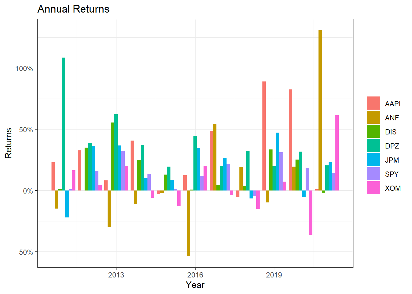
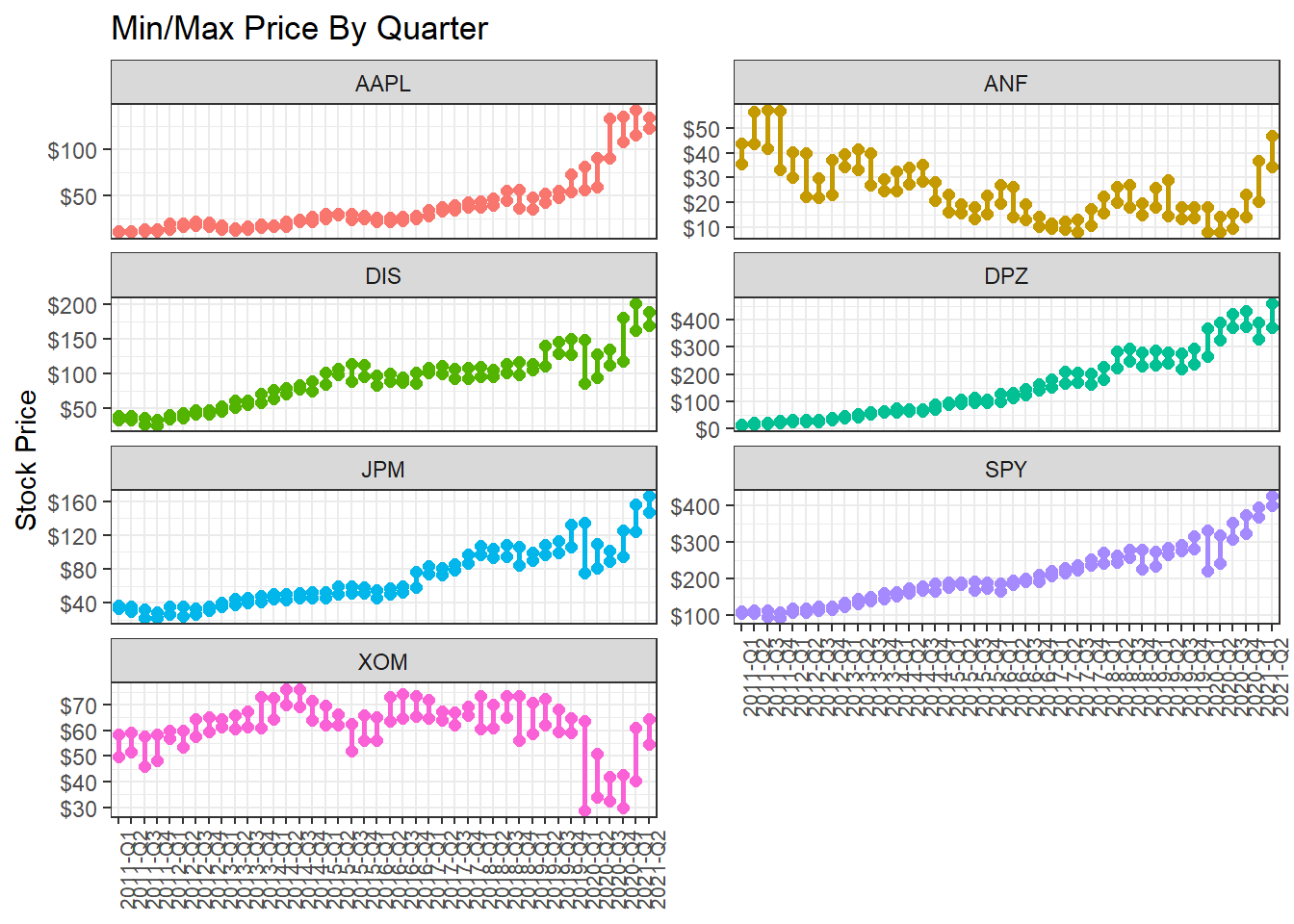
Minimum and maximum price of each stock by quarter
What if we wanted to find out and visualise the min/max price by quarter?
Investment Growth
Finally, we may want to see what our investments would have grown to, if we had invested $1000 in each of the assets on Jan 1, 2011.
#calculate 'daily wealth' returns, or what an initial investment of 1000 will grow to
cumulative_wealth <- myStocks_returns_daily %>%
  mutate(

    # generate a new variable wealth.index which is the cumulative product of 1000 * (1+daily.returns)
    wealth.index = 1000 * cumprod(1 + daily.returns)
  )


wealthplot <- ggplot(cumulative_wealth, aes(x=date, y = wealth.index, color=symbol))+
  geom_line()+
  labs(x="Year", y="Value of investment", title = "Growth of a $1000 investment over time")+
  scale_y_continuous(labels = scales::dollar) +
  guides(color=guide_legend(title=NULL))+
  theme_bw() +
  NULL

wealthplot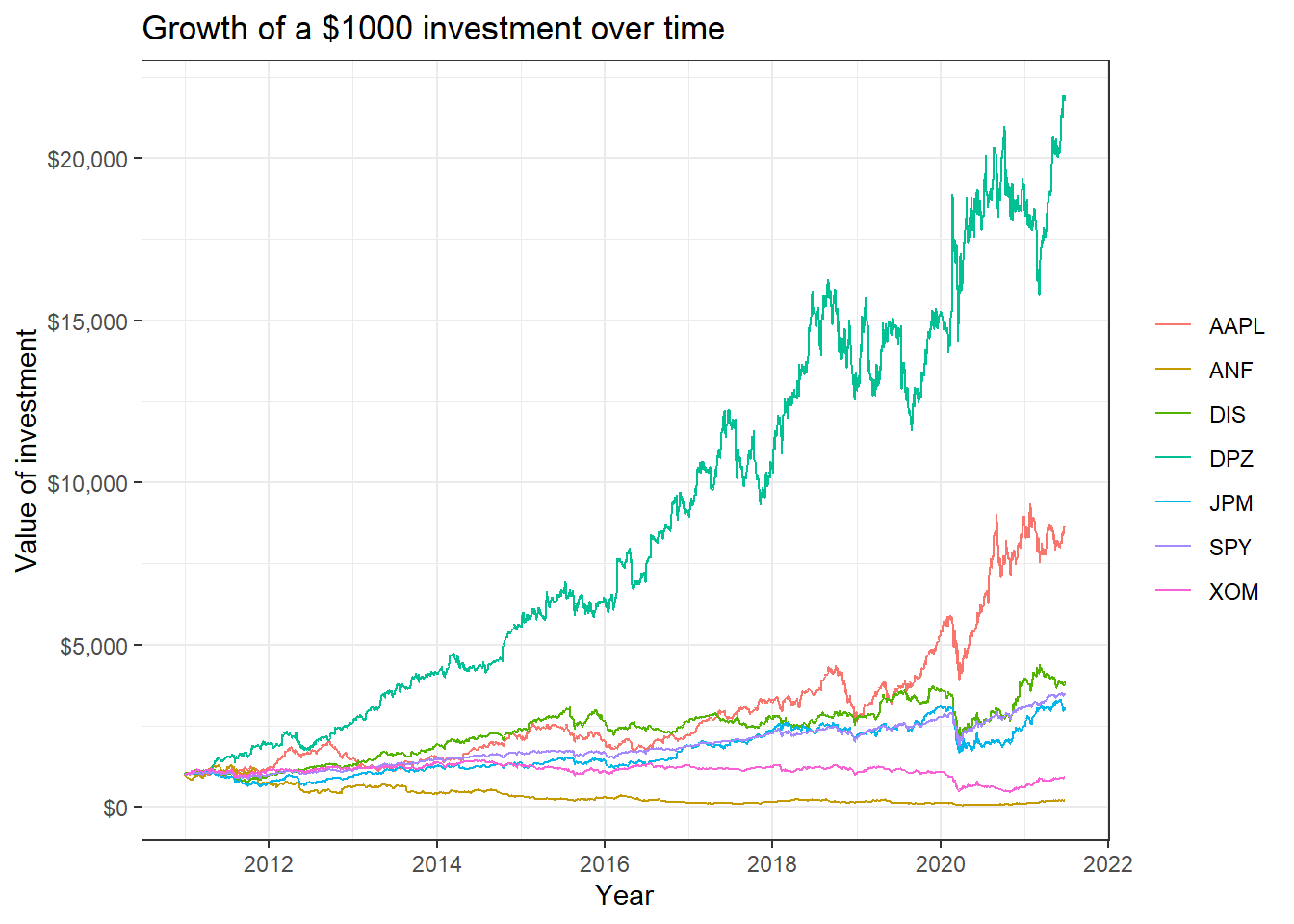
Scatterplots of individual stocks returns versus S&P500 Index returns
Besides these exploratory graphs of returns and price evolution, we also need to create scatterplots among the returns of different stocks. ggpairs from the GGally package creates a scatterplot matrix that shows the distribution of returns for each stock along the diagonal, and scatter plots and correlations for each pair of stocks. Running a ggpairs() correlation scatterplot-matrix typically takes a while to run.
#calculate daily returns
table_capm_returns <- myStocks_returns_daily %>%
            spread(key = symbol, value = daily.returns)  #just keep the period returns grouped by symbol

table_capm_returns[-1] %>% #exclude "Date", the first column, from the correlation matrix
  GGally::ggpairs() +
  theme_bw()+
    theme(axis.text.x = element_text(angle = 90, size=8),
         axis.title.x = element_blank())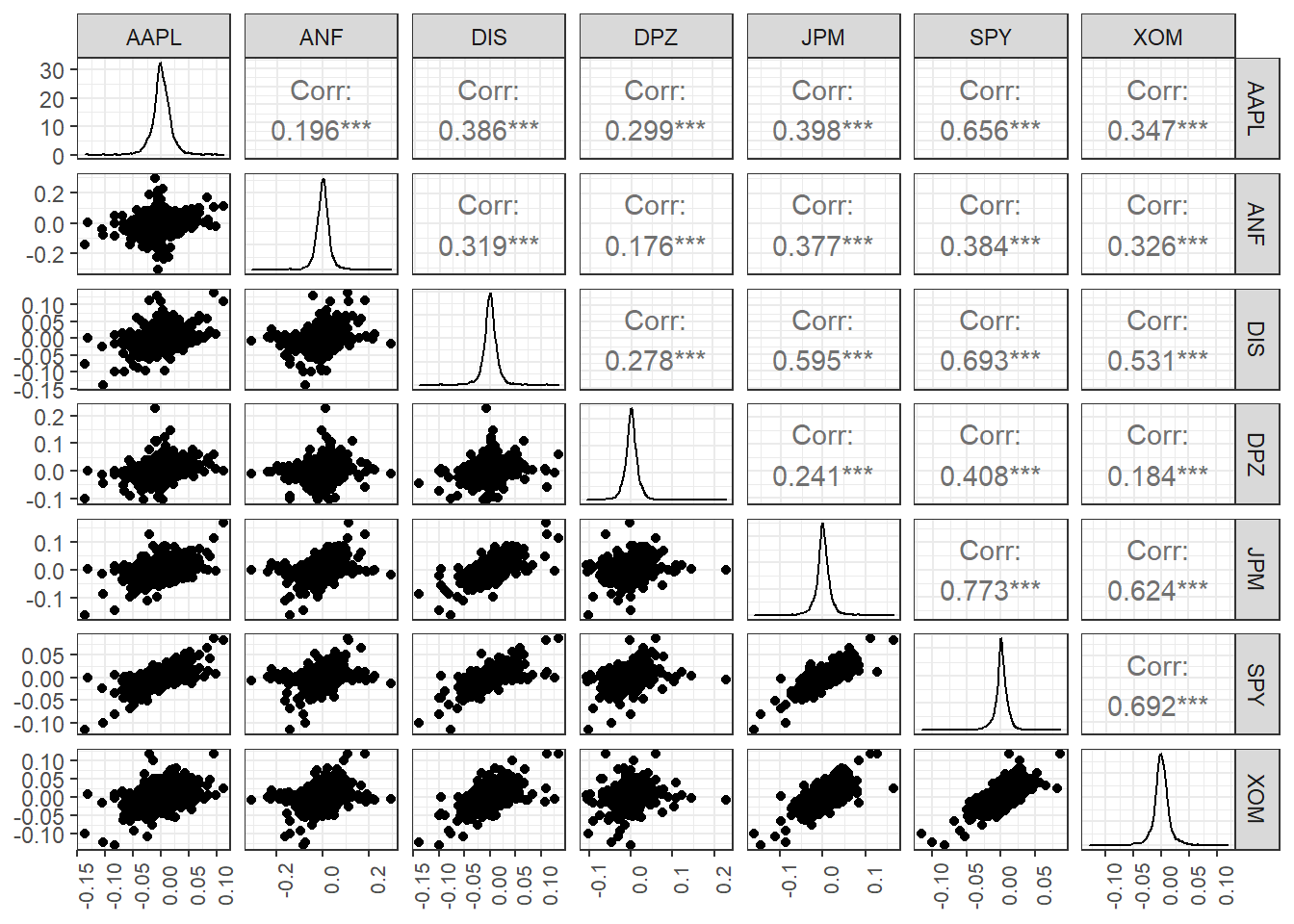
Creating a portfolio of assets
DPZ may have been the best performing stock, but you believe that you can create a portfolio of technology stocks that will beat the relevant sector index, XLK. To create a portfolio, you need to choose a few stocks and then the weights, or how much of your total investment is allocated to each stock. To keep things simple we will assume you will choose among AAPL, GOOG, MSFT, NFLX, and NVDA and you will compare your performance against the sector index, XLK. We will also add two non-tech stocks, TSLA and DPZ so we can their position on the risk/return frontier.
ticker_symbols <- c("AAPL","GOOG","MSFT","NFLX","NVDA", "XLK", "DPZ")

tech_stock_returns_monthly <- ticker_symbols %>%
    tq_get(get  = "stock.prices",
           from = "2011-01-01",
           to   = "2021-07-31") %>%
    group_by(symbol) %>%
    tq_transmute(select     = adjusted,
                 mutate_fun = periodReturn,
                 period     = "monthly",
                 col_rename = "monthly_return")


baseline_returns_monthly <- "XLK" %>%
    tq_get(get  = "stock.prices",
           from = "2011-01-01",
           to   = "2021-07-31") %>%
    tq_transmute(select     = adjusted,
                 mutate_fun = periodReturn,
                 period     = "monthly",
                 col_rename = "baseline_return")

# Summary Stats for individual Stocks
stocks_risk_return <- tech_stock_returns_monthly %>%
  tq_performance(Ra = monthly_return, Rb = NULL, performance_fun = table.Stats) %>%
  select(symbol, ArithmeticMean, GeometricMean, Minimum,Maximum,Stdev, Quartile1, Quartile3)


ggplot(stocks_risk_return, aes(x=Stdev, y = ArithmeticMean, colour= symbol, label= symbol))+
  geom_point(size = 4)+
  labs(title = 'Risk/Return profile of technology stocks',
       x = 'Risk (stdev of monthly returns)',
       y ="Average monthly return")+
  theme_bw()+
  scale_x_continuous(labels = scales::percent)+
  scale_y_continuous(labels = scales::percent)+
  geom_text_repel()+
  theme(legend.position = "none")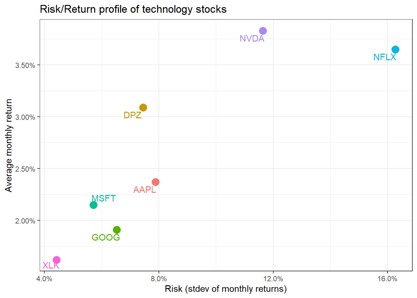
We have the monthly returns of the individual stocks and the relevant sector index. To create a portfolio, we must specify the weights; as an example, suppose we only choose three stocks and invest 50% in AAPL, 35% in NFLX, and 15% in NVDA. To do this, we create a two-column tibble, with symbols in the first column and weights in the second; any symbol not specified by default gets a weight of zero.
weights_map <- tibble(
    symbols = c("AAPL", "NFLX", "NVDA"),
    weights = c(0.5, 0.35, 0.15)
)

tech_portfolio_returns <- tech_stock_returns_monthly %>%
    tq_portfolio(assets_col  = symbol,
                 returns_col = monthly_return,
                 weights     = weights_map,
                 col_rename  = "monthly_portfolio_return")

tech_portfolio_returns %>%
    ggplot(aes(x = date, y = monthly_portfolio_return)) +
    geom_col() +
    scale_y_continuous(labels = scales::percent) +
    labs(title = "Tech Portfolio Returns",
         subtitle = "50% AAPL, 35% NFLX, and 15% NVDA",
         x = "", y = "Monthly Returns") +
theme_bw() 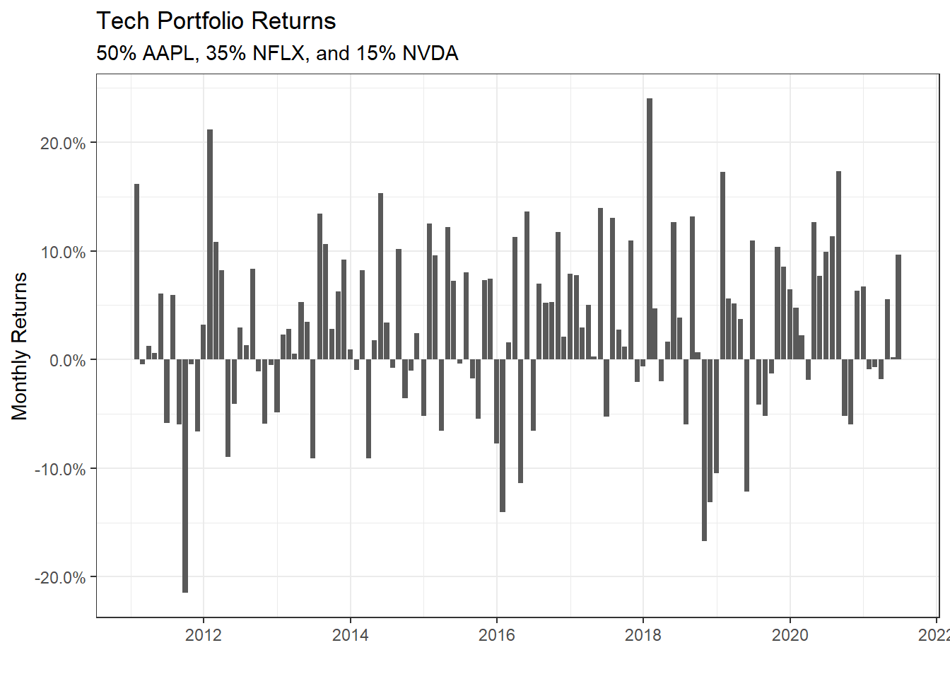
portfolio_growth_monthly <- tech_stock_returns_monthly %>%
    tq_portfolio(assets_col   = symbol,
                 returns_col  = monthly_return,
                 weights      = weights_map,
                 col_rename   = "investment.growth",
                 wealth.index = TRUE) %>%
    mutate(investment.growth = investment.growth * 1000)

plot1 <- portfolio_growth_monthly %>%
    ggplot(aes(x = date, y = investment.growth)) +
    geom_line(size = 2) +
    labs(title = "Portfolio Growth",
         subtitle = "50% AAPL, 35% NFLX, and 15% NVDA",
         x = "", y = "Portfolio Value") +
    # geom_smooth(method = "loess", se = FALSE) +
    theme_bw() +
    scale_y_continuous(labels = scales::dollar)
Now that we have our portfolio returns and the baseline returns of the XLK index, we can merge to get our consolidated table of asset and baseline returns, create a scatter plot and fit a CAPM model.
tech_single_portfolio <- left_join(tech_portfolio_returns,
                                   baseline_returns_monthly,
                                   by = "date")
tech_single_portfolio
## # A tibble: 126 x 3
## date monthly_portfolio_return baseline_return
## <date> <dbl> <dbl>
## 1 2011-01-31 0.162 0.0204
## 2 2011-02-28 -0.00466 0.0219
## 3 2011-03-31 0.0122 -0.0155
## 4 2011-04-29 0.00601 0.0261
## 5 2011-05-31 0.0609 -0.0105
## 6 2011-06-30 -0.0586 -0.0248
## 7 2011-07-29 0.0592 0.00428
## 8 2011-08-31 -0.0596 -0.0531
## 9 2011-09-30 -0.215 -0.0307
## 10 2011-10-31 -0.00422 0.102
## # ... with 116 more rowsggplot(tech_single_portfolio, aes(x = baseline_return, y= monthly_portfolio_return)) +
geom_point()+
geom_smooth(method="lm", se=FALSE) +
scale_x_continuous(labels = scales::percent) +
scale_y_continuous(labels = scales::percent) +
labs(x = "Baseline returns (XLK)",
y= "Tech Portfolio Return",
title= "How do our tech fund returns compare to the the sector index XLK")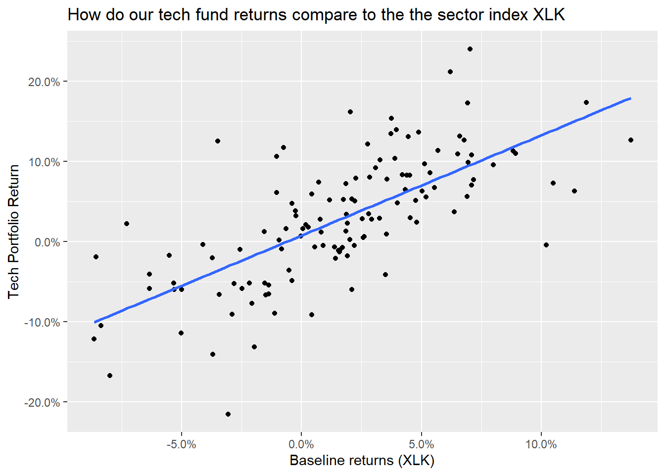
portfolio_CAPM <- lm(monthly_portfolio_return ~ baseline_return, data = tech_single_portfolio)
summary(portfolio_CAPM)
##
## Call:
## lm(formula = monthly_portfolio_return ~ baseline_return, data = tech_single_portfolio)
##
## Residuals:
## Min 1Q Median 3Q Max
## -0.18417 -0.03597 -0.00496 0.03055 0.16161
##
## Coefficients:
## Estimate Std. Error t value Pr(>|t|)
## (Intercept) 0.00755 0.00540 1.4 0.16
## baseline_return 1.24893 0.11521 10.8 <2e-16 ***
## ---
## Signif. codes: 0 '***' 0.001 '**' 0.01 '*' 0.05 '.' 0.1 ' ' 1
##
## Residual standard error: 0.0569 on 124 degrees of freedom
## Multiple R-squared: 0.487, Adjusted R-squared: 0.482
## F-statistic: 118 on 1 and 124 DF, p-value: <2e-16autoplot(portfolio_CAPM, which = 1:3) +
theme_bw()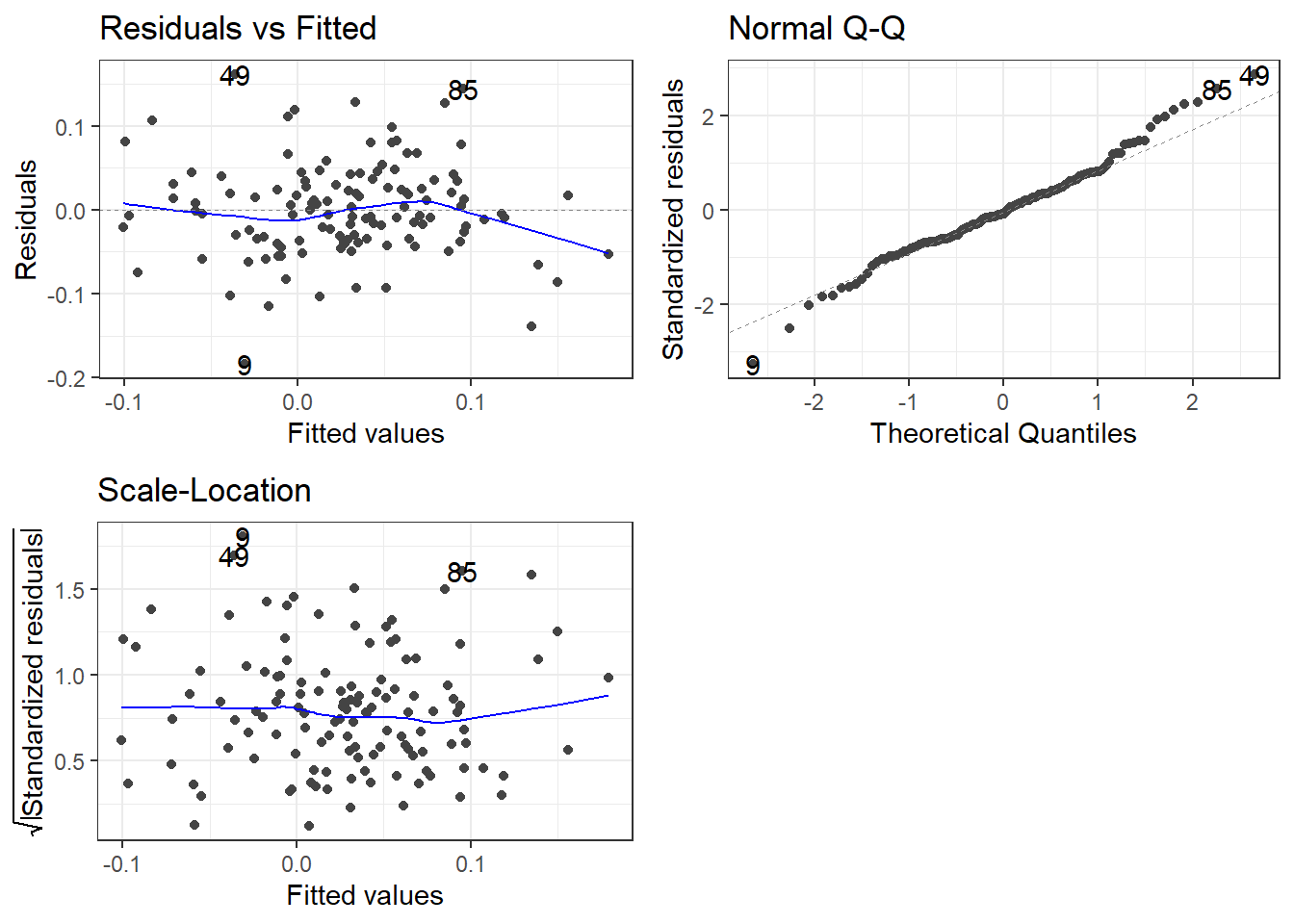
Creating various portfolios by changing weights of assets
Suppose we wanted to examine a few more portfolios by varying the weights.
- Naive portfolio: you split your investment equally among the five stocks, so each of them has a weight of 20%
- Bitcoin mining: you invest 80-20 in
NVDAandGOOG
- Binge TV watching: you invest most (70%) in
NFLXand 10% toAAPL,GOOG, andMSFT
ticker_symbols = c("AAPL", "GOOG", "MSFT", "NFLX", "NVDA")

weights <- c(
    0.2, 0.2, 0.2, 0.2, 0.2,
    0, 0.2, 0, 0, 0.8,
    0.1, 0.1, 0.1, 0, 0.7
)

weights_table <-  tibble(ticker_symbols) %>%
    tq_repeat_df(n = 3) %>%
    bind_cols(tibble(weights)) %>%
    group_by(portfolio)


stock_returns_monthly_multi <- tech_stock_returns_monthly %>%
    tq_repeat_df(n = 3)

# Calculate monthly returns for all portfolios
portfolio_returns_monthly_multi <- stock_returns_monthly_multi %>%
    tq_portfolio(assets_col   = symbol,
                 returns_col  = monthly_return,
                 weights      = weights_table,
                 col_rename   = "portfolio_return",
                 wealth.index = FALSE)

# Calculate what an investment of 1000 will grow to
portfolio_growth_monthly_multi <- stock_returns_monthly_multi %>%
    tq_portfolio(assets_col   = symbol,
                 returns_col  = monthly_return,
                 weights      = weights_table,
                 col_rename   = "investment.growth",
                 wealth.index = TRUE) %>%
    mutate(investment.growth = investment.growth * 1000)

portfolio_growth_monthly_multi %>%
  ggplot(aes(x = date, y = investment.growth, colour = as.factor(portfolio))) +
  geom_line(size = 2) +
  labs(title = "Portfolio Growth",
       subtitle = "Comparing Multiple Portfolios",
       x = "", y = "Portfolio Value",
       color = "Portfolio") +
  theme_bw()+
  scale_y_continuous(labels = scales::dollar)+
  scale_colour_discrete(name="Portfolio",
                      labels=c("Naive", "Bitcoiners", "Binge Watchers"))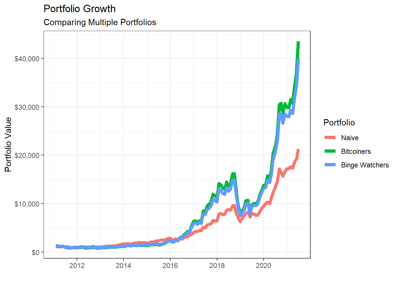
# Returns a basic set of statistics that match the period of the data passed in (e.g., monthly returns
# will get monthly statistics, daily will be daily stats, and so on).

portfolio_risk_return <- portfolio_returns_monthly_multi %>%
  tq_performance(Ra = portfolio_return, Rb = NULL, performance_fun = table.Stats) %>%
  select(portfolio, ArithmeticMean, GeometricMean, Minimum,Maximum,Stdev, Quartile1, Quartile3)

portfolio_risk_return %>%
  kable() %>%
kable_styling(c("striped", "bordered")) | portfolio | ArithmeticMean | GeometricMean | Minimum | Maximum | Stdev | Quartile1 | Quartile3 |
|---|---|---|---|---|---|---|---|
| 1 | 0.027 | 0.025 | -0.176 | 0.232 | 0.069 | -0.016 | 0.076 |
| 2 | 0.035 | 0.030 | -0.242 | 0.408 | 0.103 | -0.025 | 0.081 |
| 3 | 0.034 | 0.030 | -0.232 | 0.360 | 0.097 | -0.024 | 0.074 |
ggplot(portfolio_risk_return,
       aes(x=Stdev,
           y = ArithmeticMean,
           label= portfolio,
           colour= as.factor(portfolio)))+
  geom_point(size = 4)+
  labs(title = 'Risk/Return profile of the three portfolios',
       x = 'Risk (stdev of monthly returns)',
       y ="Average monthly return")+
  theme_bw()+
  scale_x_continuous(labels = scales::percent)+
  scale_y_continuous(labels = scales::percent)+
  scale_colour_discrete(name="Portfolio",
                      labels=c("Naive", "Bitcoiners", "Binge Watchers"))+
  geom_text_repel()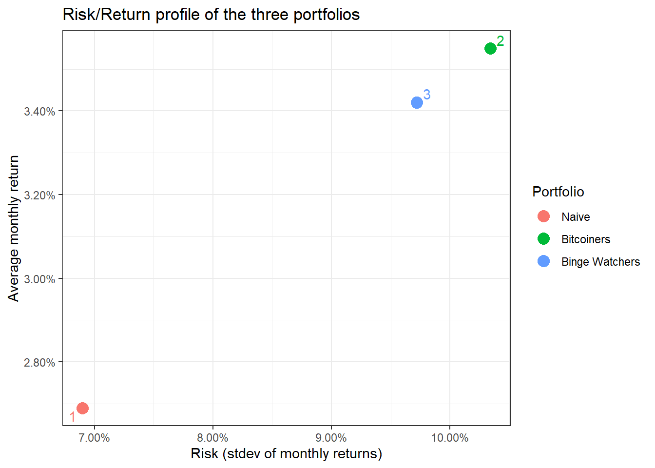
Data from the Federal Reserve Economic Data with tidyquant
A lot of economic data can be extracted from the Federal Reserve Economic Data (FRED) database. For each data we are interested, we need to get its FRED symbol; for instance, if we cared about commodities, we can select the Henry Hub Natural Gas Spot Price and notice that its FRED symbol is DHHNGSP.
So, if we wanted to download this, as well as prices of WTI crude, gold, and USD:EUR, we first identify the FRED codes which are shown below
- Henry Hub Natural Gas Spot Price:
DHHNGSP - WTI Crude Oil Prices:
DCOILWTICO - Gold Fixing Price:
GOLDAMGBD228NLBM - U.S. / Euro Exchange Rate:
DEXUSEU
To get the data and plot it
natgas_spot  <-   tq_get("DHHNGSP", get = "economic.data",
                       from = "2011-01-01",
                       to   = "2021-07-31")

ggplot(natgas_spot, aes(x=date, y=price)) +
  geom_line()+
  labs(x="Year",
       y="NatGas Spot price",
       title = "Henry Hub Natural Gas Spot Prices")+
  scale_y_continuous(labels = scales::dollar)+
  guides(fill=guide_legend(title=NULL))+
  theme_bw()+
  NULL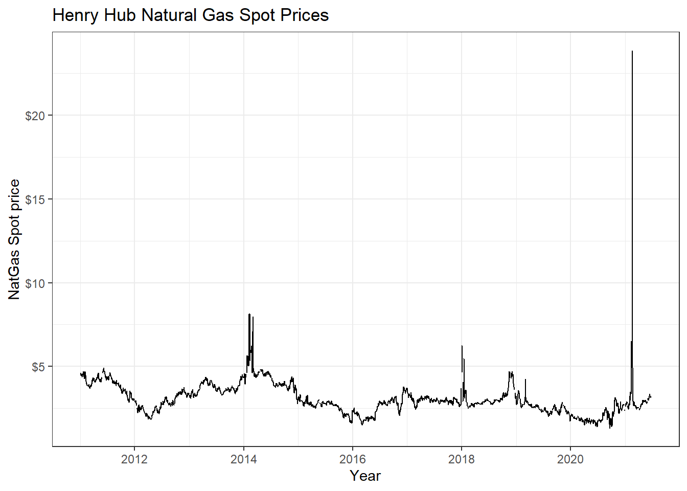
wti_price  <-   tq_get("DCOILWTICO", get = "economic.data",
                       from = "2011-01-01",
                       to   = "2021-07-31")

ggplot(wti_price, aes(x=date, y=price)) +
  geom_line()+
  labs(x="Year",
       y="WTI price",
       title = "West Texas Intermediate Crude Oil (WTI) Prices")+
  scale_y_continuous(labels = scales::dollar)+
  guides(fill=guide_legend(title=NULL))+
  theme_bw()+
  NULL
gold_price  <-   tq_get("GOLDAMGBD228NLBM", get = "economic.data",
                        from = "2011-01-01",
                        to   = "2021-07-31")

ggplot(gold_price, aes(x=date, y=price)) +
  geom_line()+
  labs(x="Year",
       y="Gold price",
       title = "Gold Fixing Price 10:30 A.M. (London time) in London Bullion Market")+
  scale_y_continuous(labels = scales::dollar)+
  guides(fill=guide_legend(title=NULL))+
  theme_bw()+
  NULL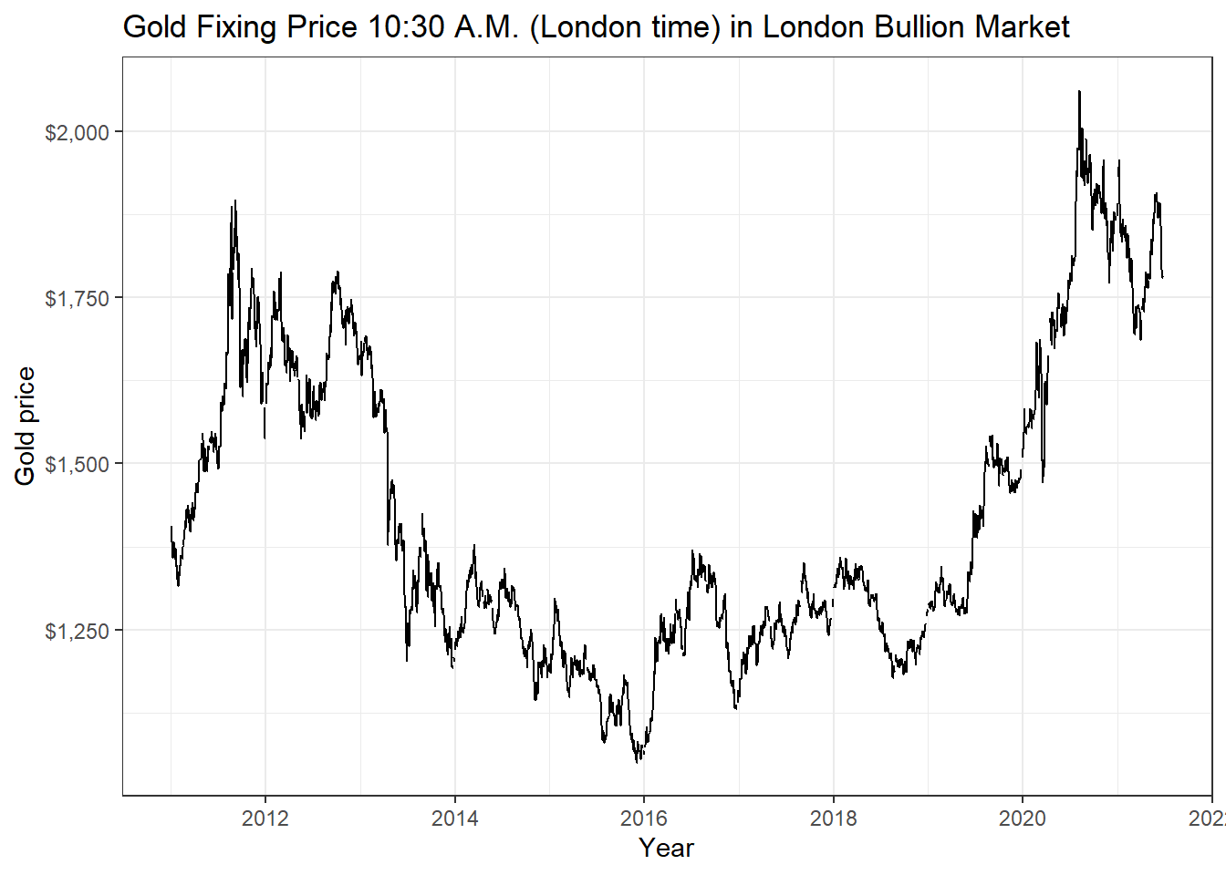
USDEUR_rate <-   tq_get("DEXUSEU", get = "economic.data",
                        from = "2011-01-01",
                        to   = "2021-07-31")

ggplot(USDEUR_rate, aes(x=date, y=price)) +
  geom_line()+
  labs(x="Year",
       y="Exchange rate",
       title = "USD to EUR Exchange Rate")+
  scale_y_continuous(labels = scales::dollar)+
  guides(fill=guide_legend(title=NULL))+
  theme_bw()+
  NULL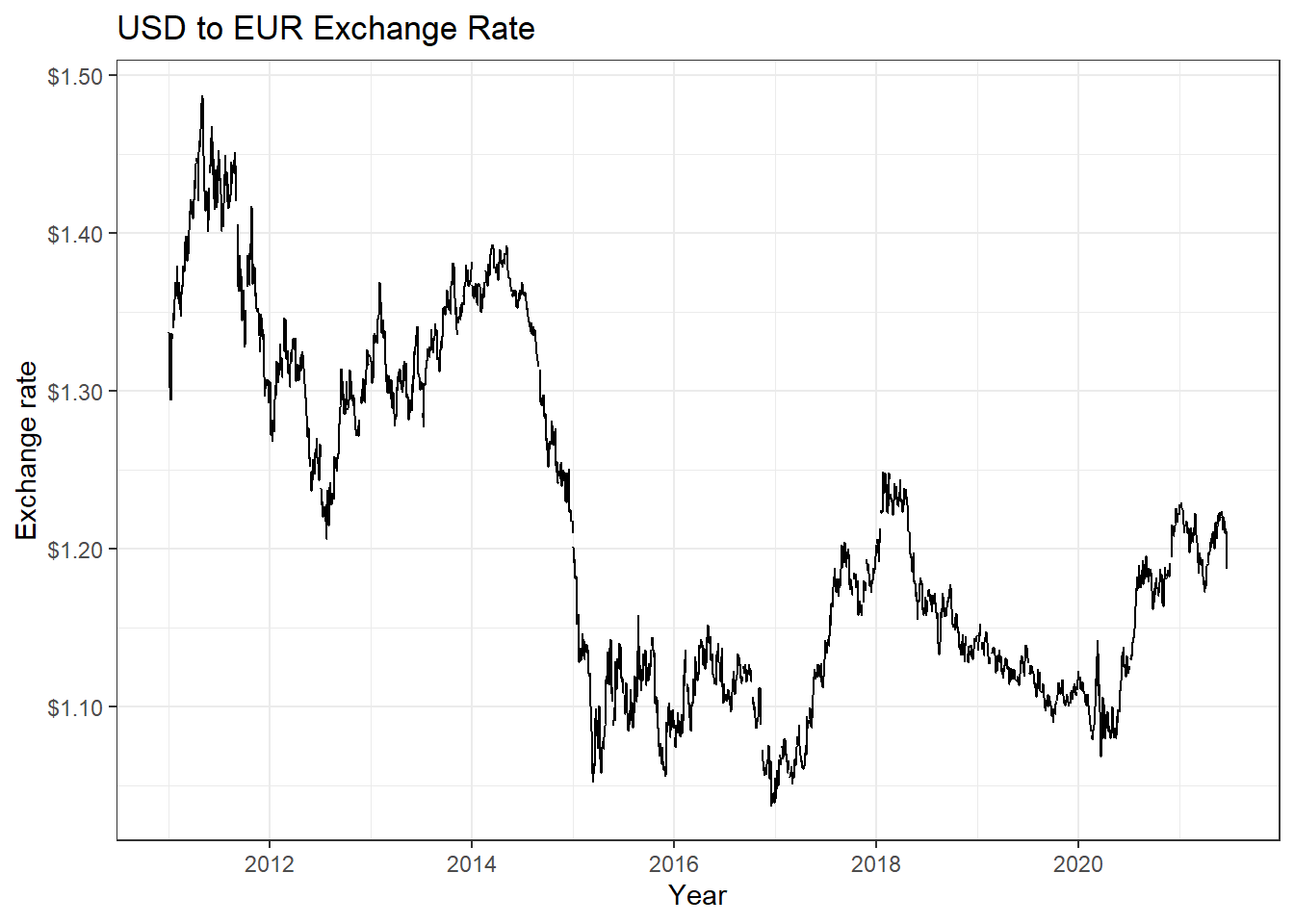
Now suppose we wanted to check if there is any correlation between natgas spot prices, WTI, and Gold prices. We will download prices, then calculate returns, calculate statistics on daily returns, and visualise some of the returns.
commodities <- c("DHHNGSP", "DCOILWTICO", "GOLDAMGBD228NLBM")

commodities_prices  <- tq_get(commodities, get = "economic.data",
                              from = "2011-01-01",
                              to   = "2021-07-31") %>%
  group_by(symbol)


commodities_returns_daily <- commodities_prices %>% na.omit() %>%
  tq_transmute(select     = price,
               mutate_fun = periodReturn,
               period     = "daily",
               type       = "log",
               col_rename = "daily.returns")

#calculate monthly  returns
commodities_returns_monthly <- commodities_prices %>%
  tq_transmute(select     = price,
               mutate_fun = periodReturn,
               period     = "monthly",
               type       = "arithmetic",
               col_rename = "monthly.returns")

favstats(daily.returns ~ symbol,  data=commodities_returns_daily) %>%
  mutate(
    annual_mean = mean *250,
    annual_sd = sd * sqrt(250)
  ) %>%
  select(symbol, min, median, max, mean, sd, annual_mean, annual_sd)  %>%
  kable() %>%
kable_styling(c("striped", "bordered")) | symbol | min | median | max | mean | sd | annual_mean | annual_sd |
|---|---|---|---|---|---|---|---|
| DCOILWTICO | -0.281 | 0.001 | 0.426 | 0 | 0.029 | 0.048 | 0.465 |
| DHHNGSP | -1.025 | 0.000 | 0.746 | 0 | 0.056 | -0.033 | 0.878 |
| GOLDAMGBD228NLBM | -0.089 | 0.000 | 0.068 | 0 | 0.010 | 0.022 | 0.155 |
ggplot(commodities_returns_daily, aes(x=daily.returns, fill=symbol))+
  geom_density()+
  coord_cartesian(xlim=c(-0.05,0.05)) +
  scale_x_continuous(labels = scales::percent_format(accuracy = 2))+
  facet_grid(rows = (vars(symbol))) +
  theme_bw()+
  labs(x="Daily Returns",
       y="Density",
       title = "Charting the Distribution of Daily Log Returns")+
  guides(fill=FALSE) +
  NULL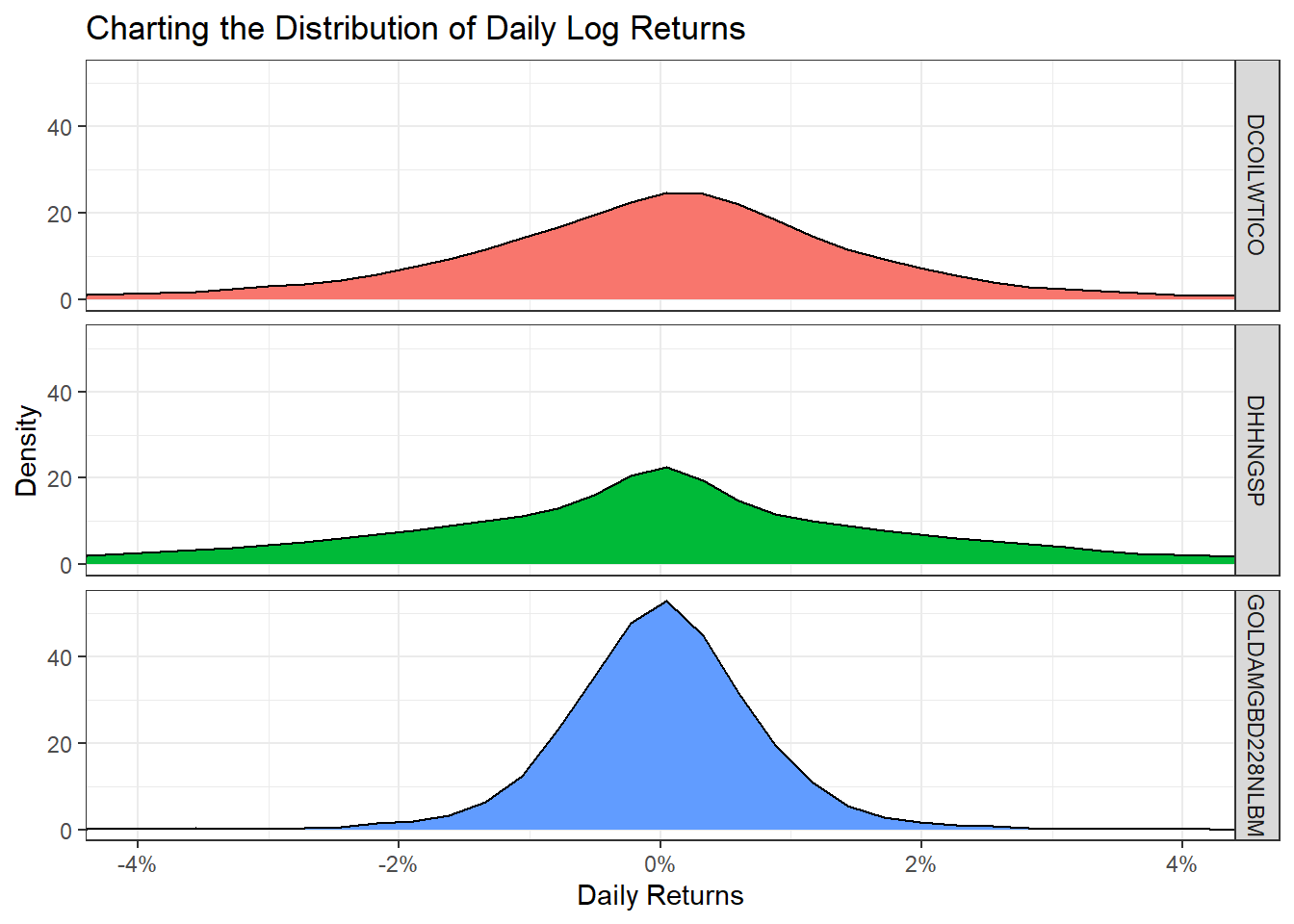
ggplot(commodities_returns_daily, aes(x=symbol, y=daily.returns))+
  geom_boxplot(aes(colour=symbol))+
  coord_flip()+
  scale_y_continuous(labels = scales::percent_format(accuracy = 2))+
  theme_bw()+
  labs(x="Daily Returns",
       y="",
       title = "Boxplot of Daily Log Returns")+
  theme(legend.position="none") +
  NULL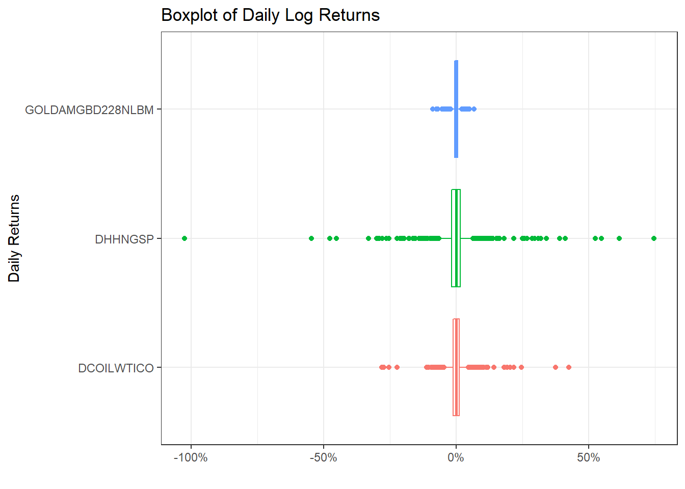
commodities_returns_daily %>%
  pivot_wider(names_from="symbol", values_from="daily.returns") %>%
  na.omit() %>%
  select(-date) %>%
  dplyr::rename(
    "NatGas" = 'DHHNGSP',
    "WTI Oil" = 'DCOILWTICO',
    "Gold" = 'GOLDAMGBD228NLBM'
  ) %>%
  ggpairs()+
  theme_bw()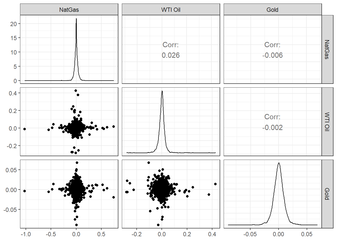
Acknowledgments
- This page is derived in part from Performance Analytics with
tidyquantby Matt Dancho.