Visualise data
Introduction to ggplot2 by visualising numeric data.
We will start with the gapminder data set. We look at its contents
glimpse(gapminder)## Rows: 1,704
## Columns: 6
## $ country <fct> Afghanistan, Afghanistan, Afghanistan, Afghanistan, Afgha...
## $ continent <fct> Asia, Asia, Asia, Asia, Asia, Asia, Asia, Asia, Asia, Asi...
## $ year <int> 1952, 1957, 1962, 1967, 1972, 1977, 1982, 1987, 1992, 199...
## $ lifeExp <dbl> 28.801, 30.332, 31.997, 34.020, 36.088, 38.438, 39.854, 4...
## $ pop <int> 8425333, 9240934, 10267083, 11537966, 13079460, 14880372,...
## $ gdpPercap <dbl> 779.4453, 820.8530, 853.1007, 836.1971, 739.9811, 786.113...Scatter plots and multiple panels using facet_wrap()
Animating changes
Racing bars! We will create a simple bar graph showing the evolution of GDP per capita for the top 8 countries
IMDB movie ratings: Scatterplots and relationships
For this section, we will use a sample of movies released since 2000 with data from IMDB. We have data on movies from the following six genres:
- Action
- Adventure
- Comedy
- Drama
- Animation
- Documentary
imdb <- read_csv(here::here("data", "movies.csv"))
imdb_short <- imdb %>%
  filter(genre %in% c("Action", "Adventure", "Comedy", "Drama", "Animation", "Documentary"),
year >= 2000)glimpse(imdb_short)## Rows: 1,762
## Columns: 11
## $ title <chr> "Avatar", "Jurassic World", "The Avengers", "Th...
## $ genre <chr> "Action", "Action", "Action", "Action", "Action...
## $ director <chr> "James Cameron", "Colin Trevorrow", "Joss Whedo...
## $ year <dbl> 2009, 2015, 2012, 2008, 2015, 2012, 2004, 2013,...
## $ duration <dbl> 178, 124, 173, 152, 141, 164, 93, 146, 151, 103...
## $ gross <dbl> 760505847, 652177271, 623279547, 533316061, 458...
## $ budget <dbl> 2.37e+08, 1.50e+08, 2.20e+08, 1.85e+08, 2.50e+0...
## $ cast_facebook_likes <dbl> 4834, 8458, 87697, 57802, 92000, 106759, 1148, ...
## $ votes <dbl> 886204, 418214, 995415, 1676169, 462669, 114433...
## $ reviews <dbl> 3777, 1934, 2425, 5312, 1752, 3514, 688, 1208, ...
## $ rating <dbl> 7.9, 7.0, 8.1, 9.0, 7.5, 8.5, 7.2, 7.6, 7.3, 8....IMDB movie ratings: Boxplots, violin plots
Let us consider the rating movies got according to their genre. How can we visualise the distribution of ratings?
ggplot(imdb_short,
       aes(x=rating, y = genre, fill = genre,  alpha = 0.2))+
  geom_boxplot()+
  theme_minimal()+
  theme(legend.position = "none")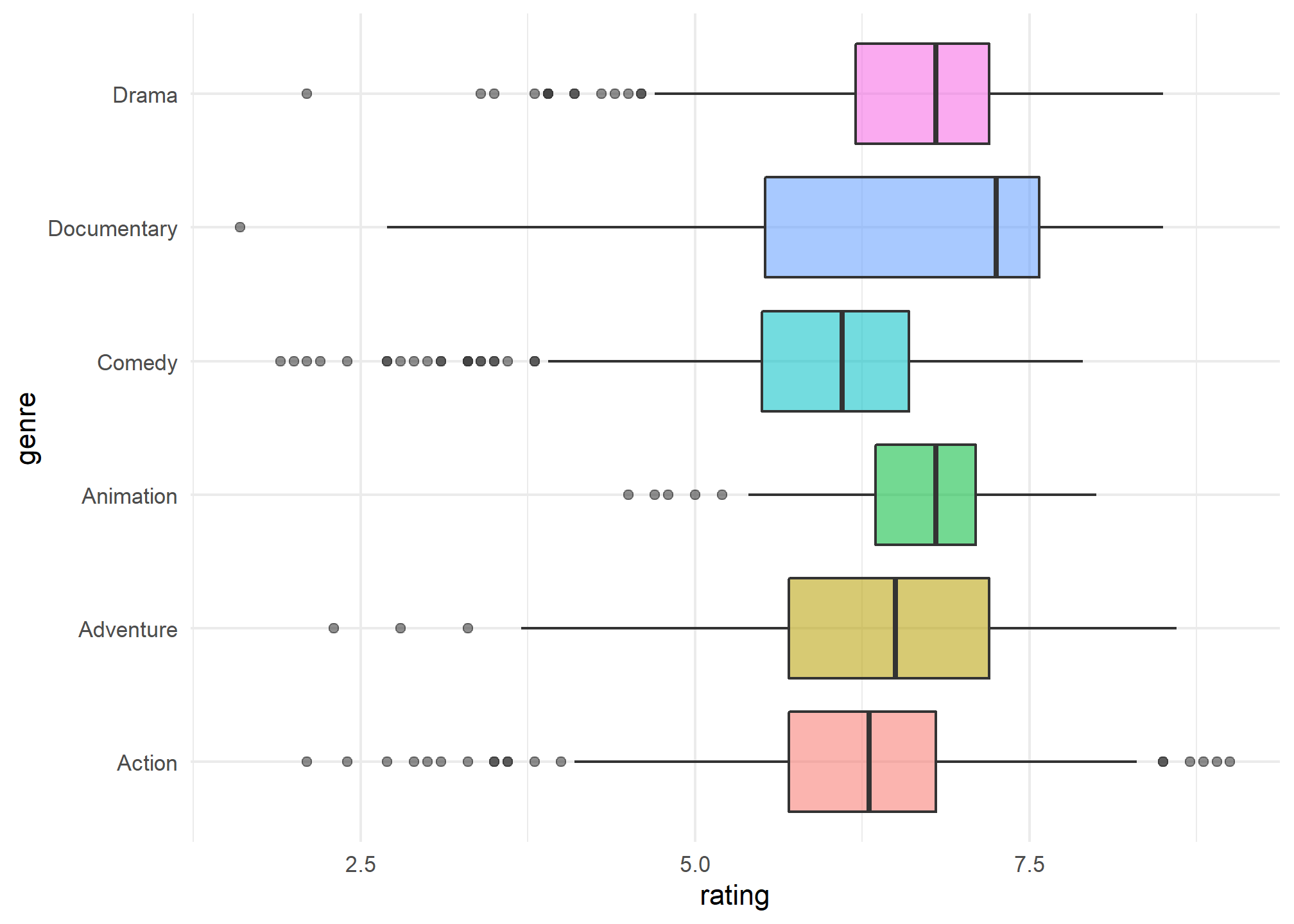
ggplot(imdb_short,
       aes(x=rating, y = genre, fill = genre,  alpha = 0.2))+
  geom_violin()+
  theme_minimal()+
  theme(legend.position = "none")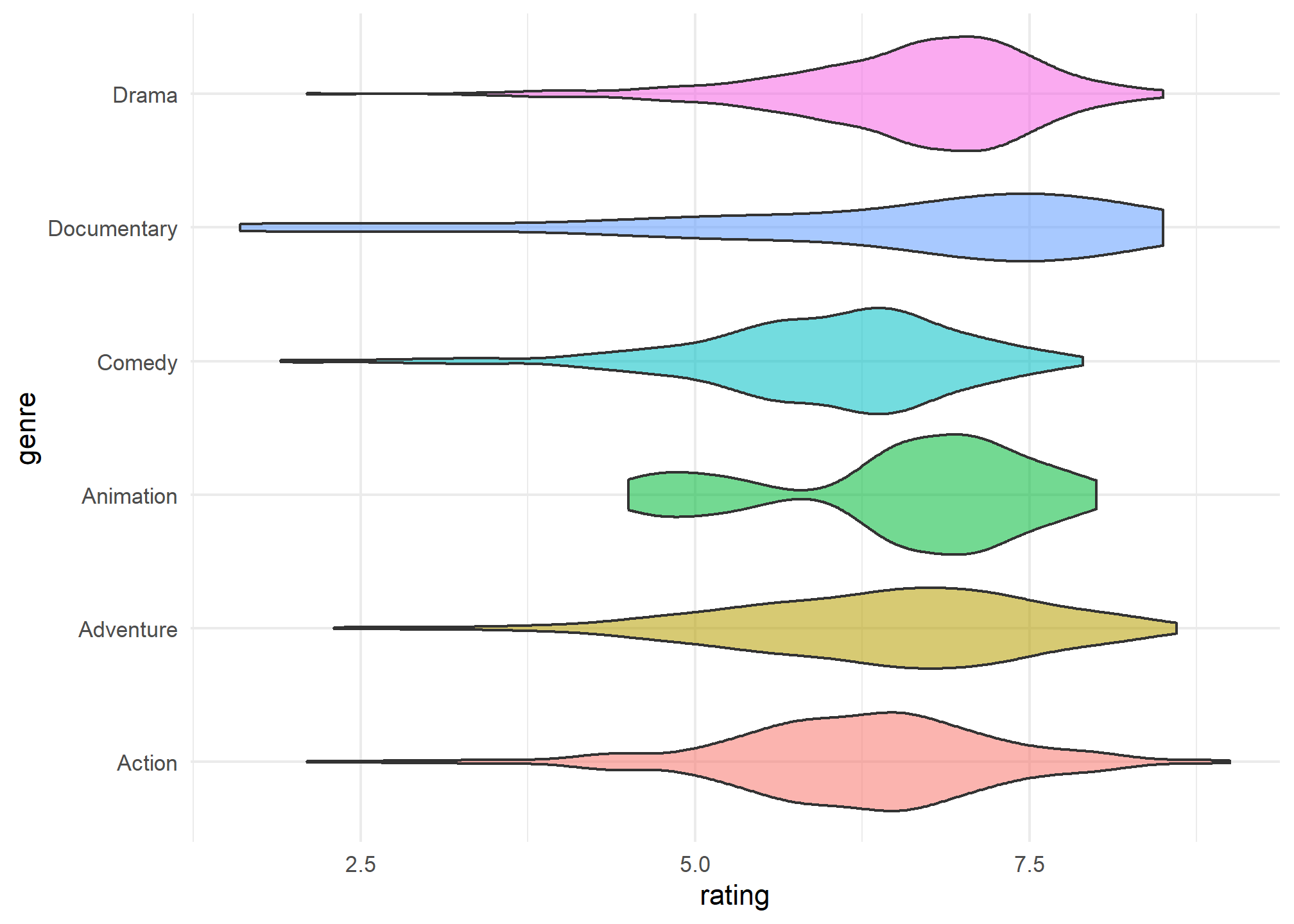
Multiple panels using facet_wrap() and facet_grid()
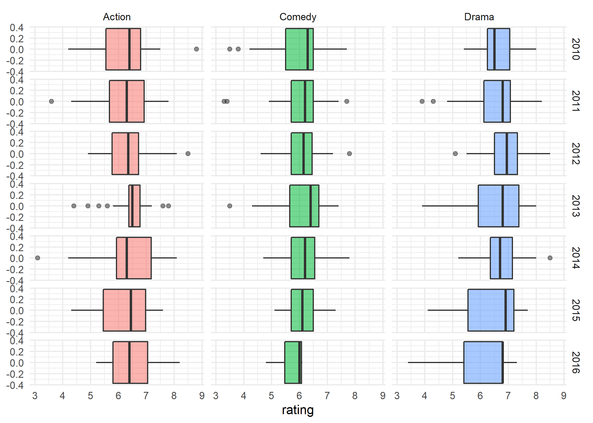
imdb_short %>%
  filter(genre %in% c("Action", "Comedy", "Drama"),
         year >= 2010) %>%
ggplot(aes(x=rating,  fill = genre,  alpha = 0.2))+
  geom_boxplot()+
  theme_minimal()+
  theme(legend.position = "none")+
  facet_grid(
    rows= vars(year),
    cols= vars(genre)
  )
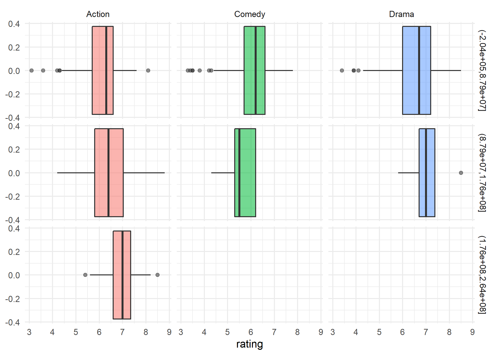
imdb_short %>%
  filter(genre %in% c("Action", "Comedy", "Drama"),
         year >= 2010) %>%
ggplot(aes(x=rating,  fill = genre,  alpha = 0.2))+
  geom_boxplot()+
  theme_minimal()+
  theme(legend.position = "none")+
  facet_grid(
    rows= vars(cut(budget, 3)),
    cols= vars(genre)
  )