Exploratory Data Analysis for Modelling
You may remember the Happy Feet movie and here is an Adélie penguin singing My Way. We shall analyse data that were collected and made available by Dr. Kristen Gorman and the Palmer Station, Antarctica LTER. The dataset contains data for 344 penguins on 3 different species of penguins (Adélie, Chinstrap, and Gentoo), collected from 3 islands in the Palmer Archipelago, Antarctica.
This great artwork was made by [@allison_horst](https://twitter.com/allison_horst)
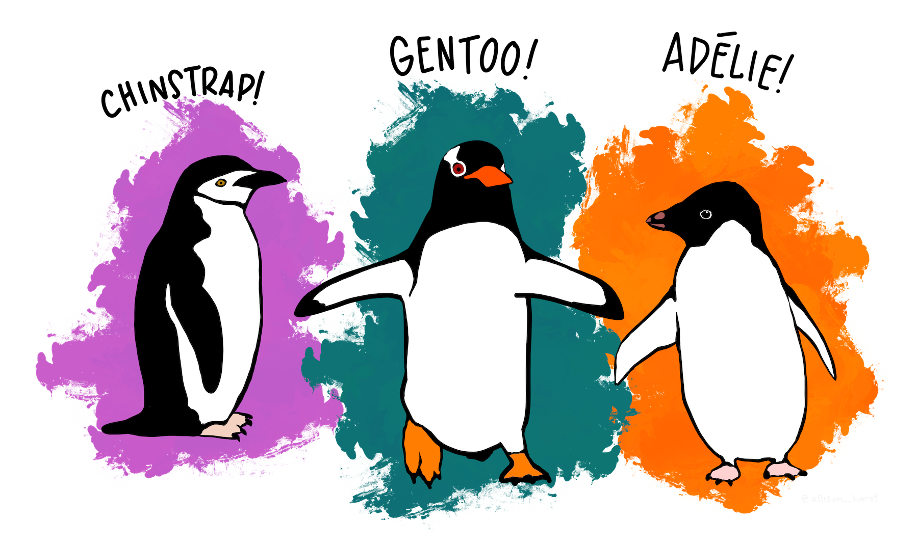
and if you are a Happy Feet fan, these are the penguins we have data on
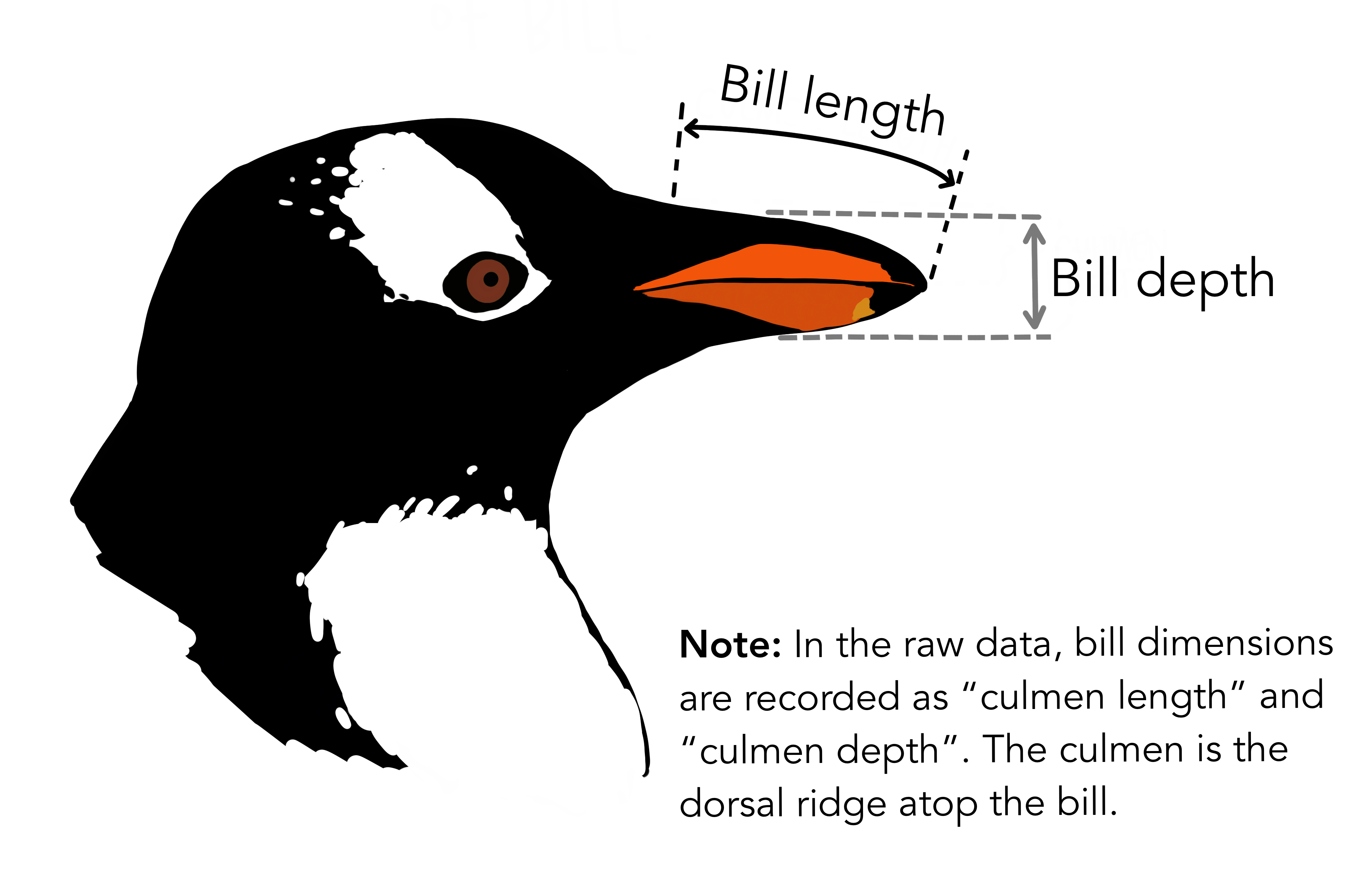
Penguin Bill dimensions
The culmen is the upper ridge of a bird’s bill. In the simplified penguins data, culmen length and depth are renamed as variables bill_length_mm and bill_depth_mm to be more intuitive.
For this penguin data, the culmen (bill) length and depth are measured as shown below:
Exploratory Data Analysis (EDA).
The variable of interest is penguin body mass. We want to see whether body mass is related to any of the other variables included in the dataframe. So let us start by looking at the data
library(palmerpenguins)
glimpse(penguins)
## Rows: 344
## Columns: 8
## $ species <fct> Adelie, Adelie, Adelie, Adelie, Adelie, Adelie, A...
## $ island <fct> Torgersen, Torgersen, Torgersen, Torgersen, Torge...
## $ bill_length_mm <dbl> 39.1, 39.5, 40.3, NA, 36.7, 39.3, 38.9, 39.2, 34....
## $ bill_depth_mm <dbl> 18.7, 17.4, 18.0, NA, 19.3, 20.6, 17.8, 19.6, 18....
## $ flipper_length_mm <int> 181, 186, 195, NA, 193, 190, 181, 195, 193, 190, ...
## $ body_mass_g <int> 3750, 3800, 3250, NA, 3450, 3650, 3625, 4675, 347...
## $ sex <fct> male, female, female, NA, female, male, female, m...
## $ year <int> 2007, 2007, 2007, 2007, 2007, 2007, 2007, 2007, 2...skimr::skim(penguins)| Name | penguins |
| Number of rows | 344 |
| Number of columns | 8 |
| _______________________ | |
| Column type frequency: | |
| factor | 3 |
| numeric | 5 |
| ________________________ | |
| Group variables | None |
Variable type: factor
| skim_variable | n_missing | complete_rate | ordered | n_unique | top_counts |
|---|---|---|---|---|---|
| species | 0 | 1.00 | FALSE | 3 | Ade: 152, Gen: 124, Chi: 68 |
| island | 0 | 1.00 | FALSE | 3 | Bis: 168, Dre: 124, Tor: 52 |
| sex | 11 | 0.97 | FALSE | 2 | mal: 168, fem: 165 |
Variable type: numeric
| skim_variable | n_missing | complete_rate | mean | sd | p0 | p25 | p50 | p75 | p100 | hist |
|---|---|---|---|---|---|---|---|---|---|---|
| bill_length_mm | 2 | 0.99 | 43.92 | 5.46 | 32.1 | 39.23 | 44.45 | 48.5 | 59.6 | ▃▇▇▆▁ |
| bill_depth_mm | 2 | 0.99 | 17.15 | 1.97 | 13.1 | 15.60 | 17.30 | 18.7 | 21.5 | ▅▅▇▇▂ |
| flipper_length_mm | 2 | 0.99 | 200.92 | 14.06 | 172.0 | 190.00 | 197.00 | 213.0 | 231.0 | ▂▇▃▅▂ |
| body_mass_g | 2 | 0.99 | 4201.75 | 801.95 | 2700.0 | 3550.00 | 4050.00 | 4750.0 | 6300.0 | ▃▇▆▃▂ |
| year | 0 | 1.00 | 2008.03 | 0.82 | 2007.0 | 2007.00 | 2008.00 | 2009.0 | 2009.0 | ▇▁▇▁▇ |
GGally::ggpairs() to get scatter plot + correlation matrix
GGally::ggpairs() is a useful tool for exploring distributions and correlations.
ggpairs1 <- penguins %>%
  na.omit() %>%
  select( body_mass_g, flipper_length_mm, bill_length_mm, bill_depth_mm, species, sex, island) %>%
  rename(`Flipper length(mm)` = flipper_length_mm,
         `Body mass (g)` = body_mass_g,
         `Bill length (mm)` = bill_length_mm,
         `Bill depth (mm)` = bill_depth_mm) %>%
  GGally::ggpairs() +
  theme_minimal()

ggpairs1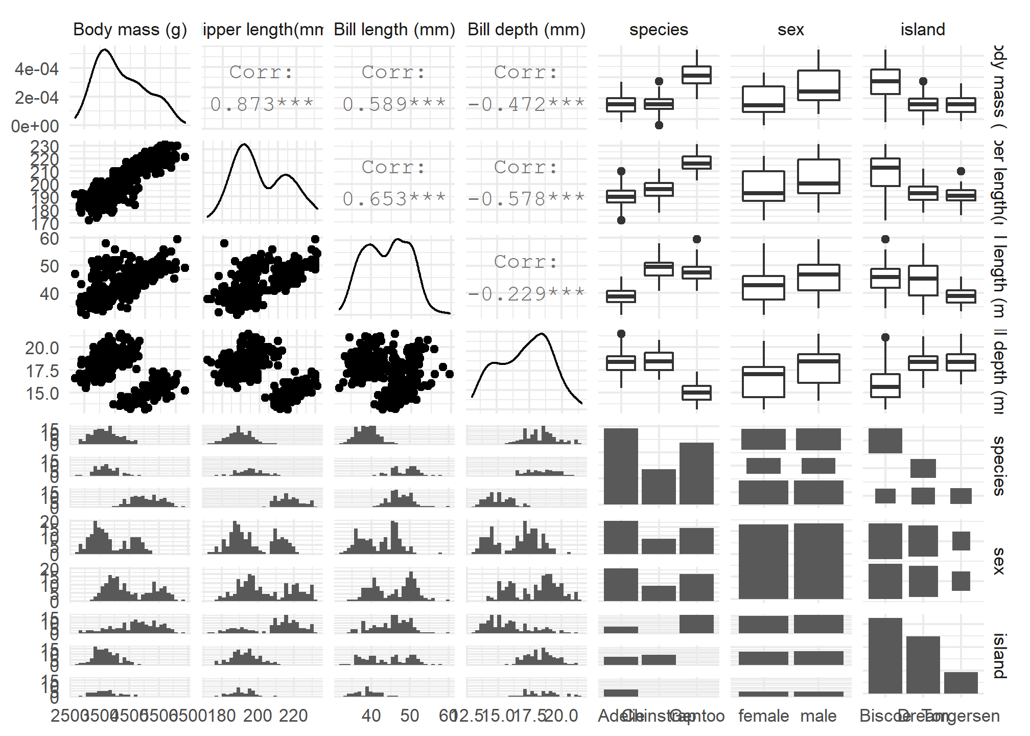
ggpairs() provides a lot of information, so let us spend some time deciphering this chart.
- Along the diagonal we get a density plot of each variable of interest. For instance, body mass seems to be right skewed, and the rest of the variables seem bimodal.
- The upper part of the matrix, shows correlation coefficients– to determine between which variables, read off the corresponding row and column header
- The bottom part provides a scatterplot between any two variables which you can again determine by looking at the row/column they correspond.
- For categorical variables (species, sex, island), we do not get any numerical values, but rather histograms and boxplots that show the distribution of outcomes. If we wanted to get a numerical correlation value, we would use the
polycorpackage andpolycor::hetcor()that calculates polyserial correlations between numeric and ordinal variables, and polychoric correlations between ordinal variables, but this is outside the scope of this class.
Which correlation is the highest? That between body mass and flipper length, or 0.873. We can see the scatterplot of these two variables in the upper left, just underneath the density plot of body mass, whereas to the right of the body mass density plot we can see the correlation value of 0.873. We could somehow “see” a line through these points. In building a model for body mass, surely flipper length will be the first variable to consider and the one that would explain a fair bit of the variation in body mass.
What about the lowest correlation? That seems to be the one between bill length and bill depth, with a correlation value of -0.229. On the face of it, there seems to be very weak relationship between these two variables.
What about the second lowest correlation? Numerically, it is the one between body mass and bill depth (-0.472). However, if you look at the corresponding scatterplot in the lower left corner you see two clusters of points, so we need to dig a bit deeper.
Dummy variables
Dummy, or categorical, variables allows us to incorporate non-numeric data into our analysis. In this example we have two categorical variables (species, sex) and we can use ggpairs() to dig a bit deeper and then use these categorical variables in our modelling. The first scatterplot matrix does not take into consideration the species or the sex of the penguins, variables that may help explain differences in body mass.
ggpairs2 <- penguins %>%
  na.omit() %>%
  select( species, sex, body_mass_g, flipper_length_mm, bill_length_mm, bill_depth_mm) %>%
  rename(`Flipper lenght(mm)` = flipper_length_mm,
         `Body mass (g)` = body_mass_g,
         `Bill length (mm)` = bill_length_mm,
         `Bill depth (mm)` = bill_depth_mm) %>%
  GGally::ggpairs(aes(colour=species, shape=species),
                  alpha = 0.4) +
  scale_colour_manual(values = c("darkorange","purple","cyan4")) +
  scale_fill_manual(values = c("darkorange","purple","cyan4")) +
  theme_minimal()


ggpairs2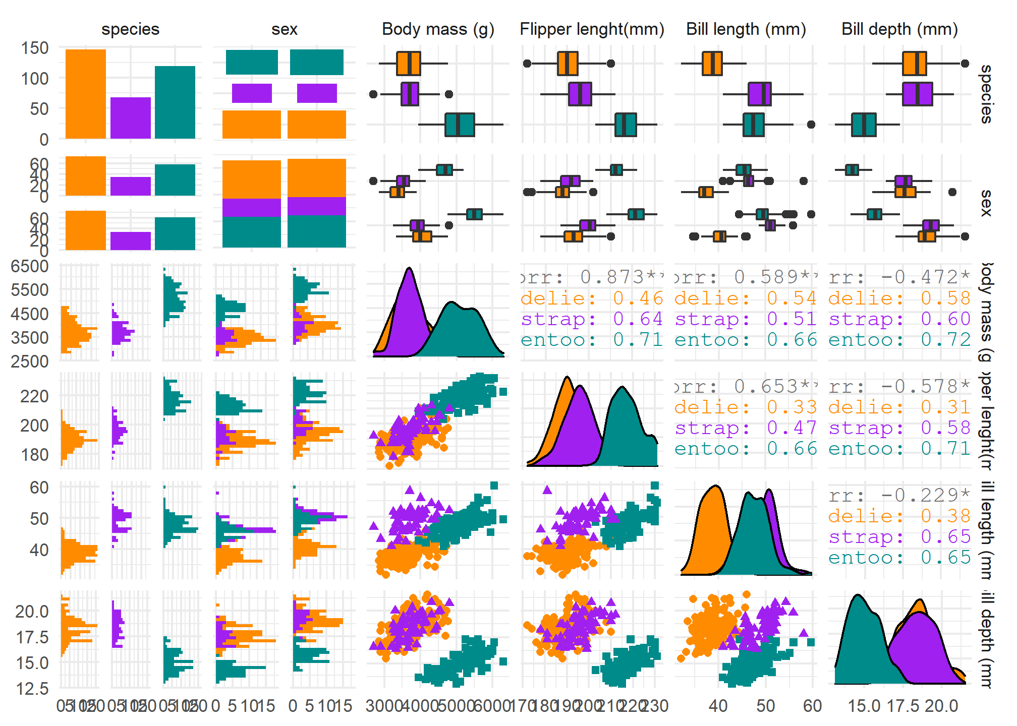
When we include the categorical (factor) variables of species and sex, and since these are no longer numerical values, we get boxplots and histograms. For instance to explore the relationship between body mass and species, look at the upper left of the table; yo can see that the green penguins (Gentoo) seem to be heavier than the other two species which may have no difference between them.
Since this plot may be confusing, let us just concentrate on the scatterplot matrix of numerical values coloured by species.
ggpairs3 <- penguins %>%
  na.omit() %>%
  select( species, sex, body_mass_g, flipper_length_mm, bill_length_mm, bill_depth_mm) %>%
  rename(`Flipper lenght(mm)` = flipper_length_mm,
         `Body mass (g)` = body_mass_g,
         `Bill length (mm)` = bill_length_mm,
         `Bill depth (mm)` = bill_depth_mm) %>%
  GGally::ggpairs(aes(colour=species, shape=species),
                  alpha = 0.4,
                  columns = c(3:6)) +
  scale_colour_manual(values = c("darkorange","purple","cyan4")) +
  scale_fill_manual(values = c("darkorange","purple","cyan4")) +
  theme_minimal()


ggpairs3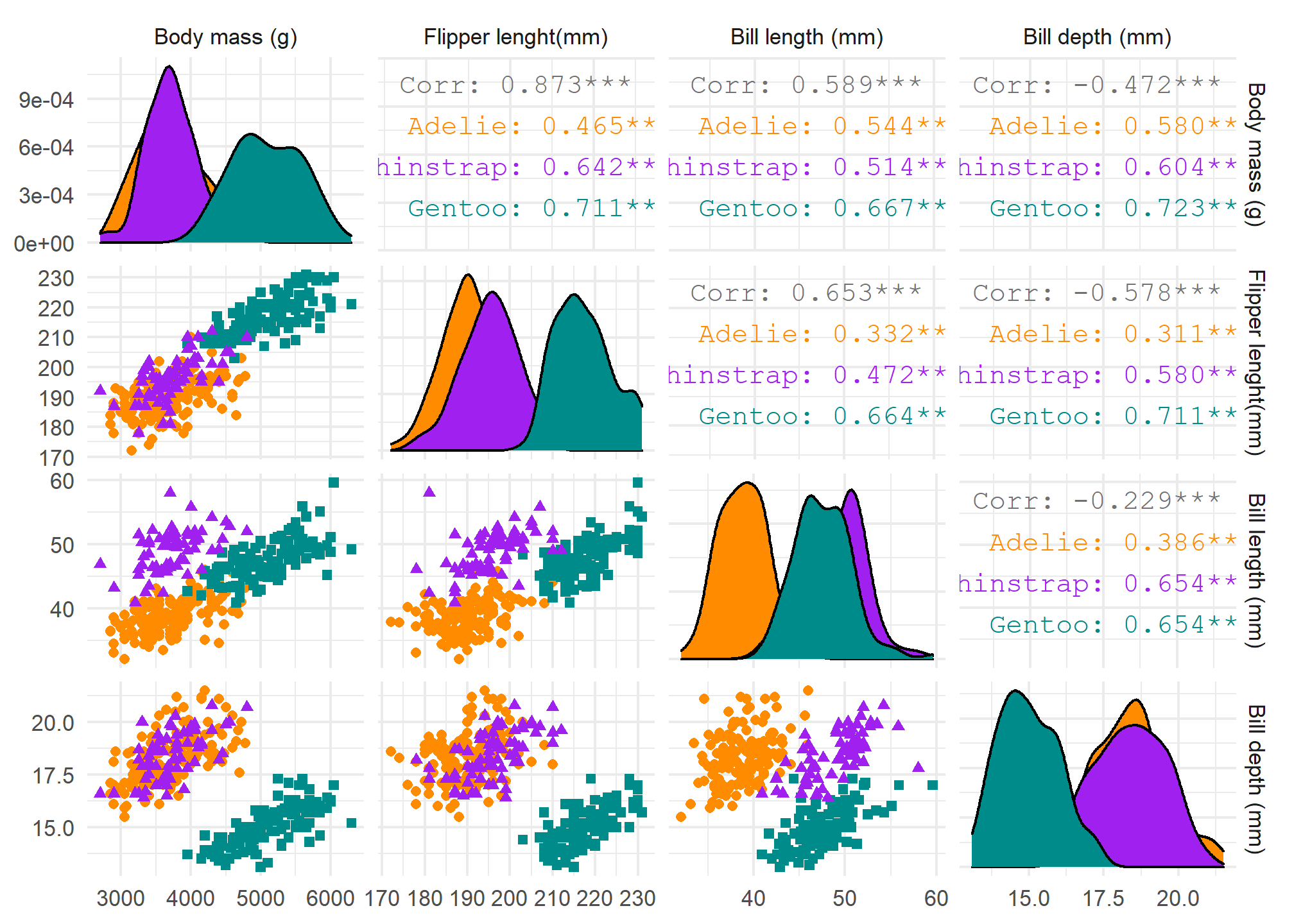
Modelling considerations of numerical variables
Let us examine the relationship between body mass and flipper length, and body mass and bill depth.
Penguin body mass vs flipper length
mass_flipper <- ggplot(data = penguins,
                       aes(x = flipper_length_mm,
                           y = body_mass_g)) +
  geom_point(aes(colour = species,
                 shape = species),
             size = 3,
             alpha = 0.6) +
  theme_minimal() +
  geom_smooth(method = "lm", se=FALSE, aes(colour = species)) +
  scale_color_manual(values = c("darkorange","purple","cyan4")) +
  labs(title = "Penguin size, Palmer Station LTER",
       subtitle = "Flipper length and body mass for Adelie, Chinstrap and Gentoo Penguins",
       x = "Flipper length (mm)",
       y = "Body mass (g)",
       color = "Penguin species",
       shape = "Penguin species") +
  theme(legend.position = c(0.2, 0.7),
        legend.background = element_rect(fill = "white", colour = NA),
        plot.title.position = "plot",
        plot.caption = element_text(hjust = 0, face= "italic"),
        plot.caption.position = "plot")

mass_flipper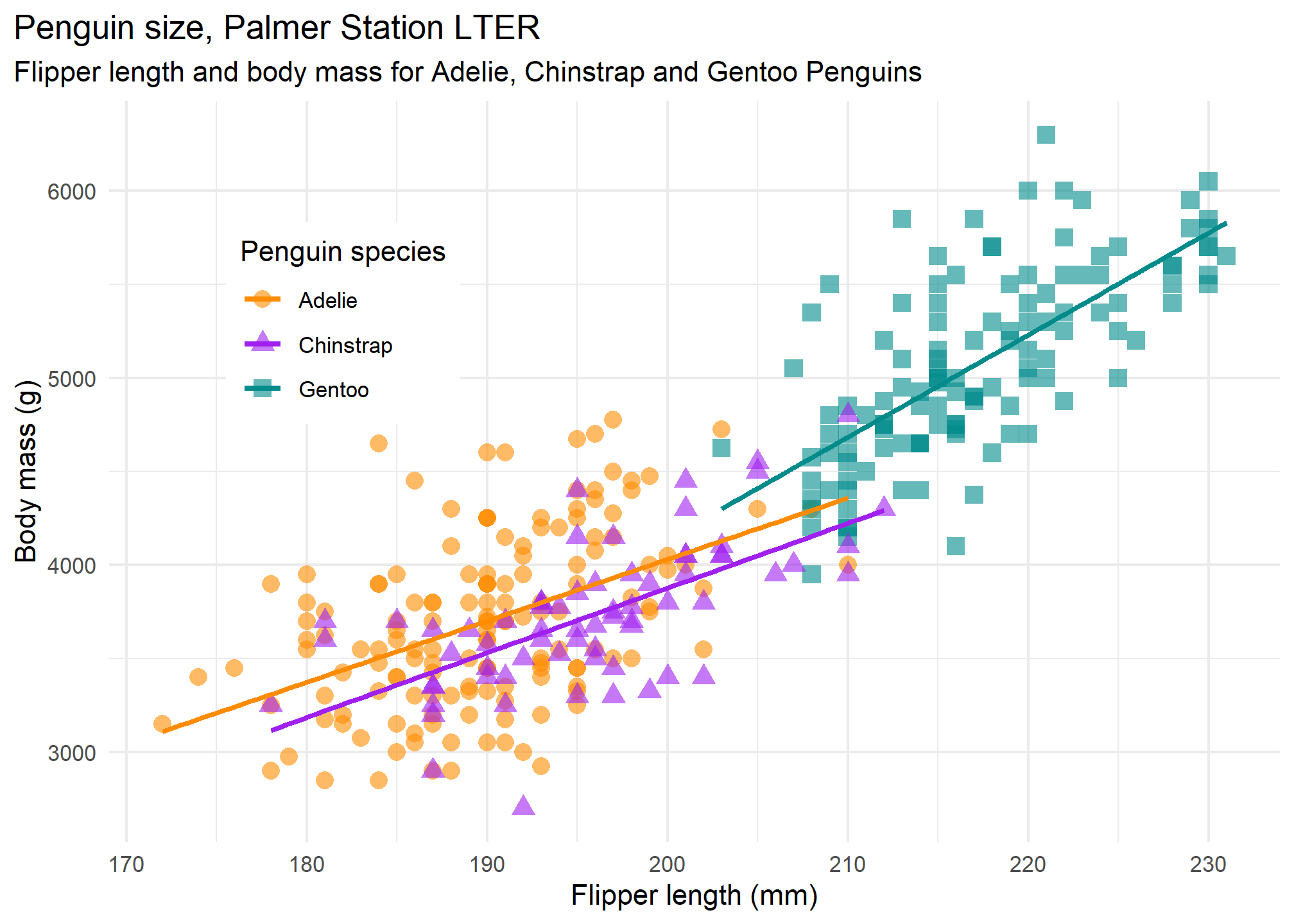
Penguin body mass vs bill depth
mass_bill_depth <- ggplot(data = penguins,
aes(x = bill_depth_mm,
y = body_mass_g)) +
geom_point(aes(colour = species,
shape = species),
size = 3,
alpha = 0.6) +
theme_minimal() +
geom_smooth(method = "lm", se=FALSE, aes(colour = species)) +
scale_color_manual(values = c("darkorange","purple","cyan4")) +
labs(title = "Penguin size, Palmer Station LTER",
subtitle = "Bill depth and body mass for Adelie, Chinstrap and Gentoo Penguins",
x = "Bill depth (mm)",
y = "Body mass (g)",
color = "Penguin species",
shape = "Penguin species") +
theme(legend.position = c(0.8, 0.8),
legend.background = element_rect(fill = "white", colour = NA),
plot.title.position = "plot",
plot.caption = element_text(hjust = 0, face= "italic"),
plot.caption.position = "plot")
mass_bill_depth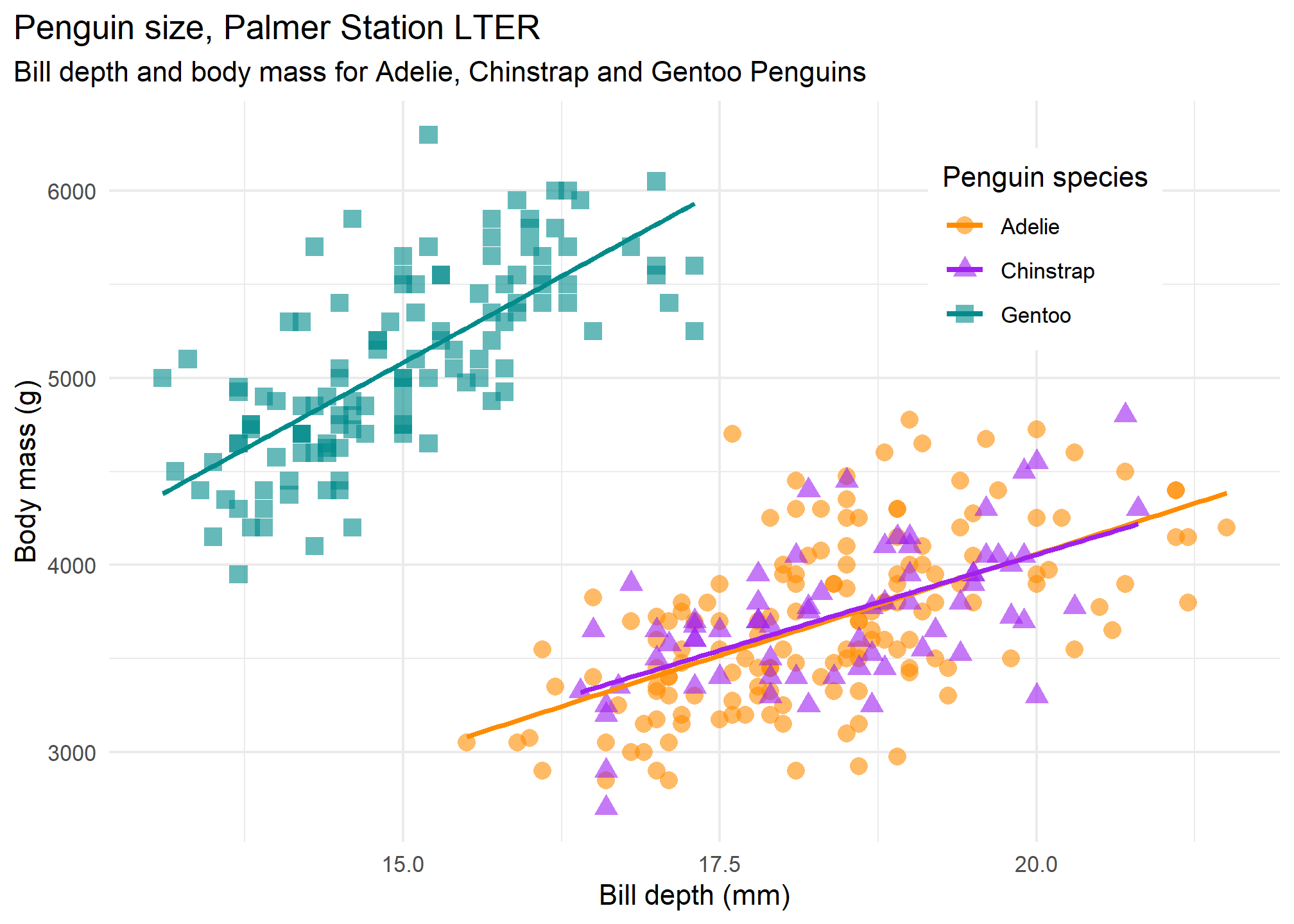 This shows that there is very little difference between Adelie and Chinstrap, but Gentoo is markedly different. All three species have a positive relationship (as bill depth increases, so does body mass), which is not what the numerical correlation coefficient of -0.472 would have us believe.
Penguin body mass and flipper size, faceted by sex
ggplot(penguins, aes(x = flipper_length_mm,
                            y = body_mass_g)) +
  geom_point(aes(colour = sex)) +
  theme_minimal() +
  scale_color_manual(values = c("darkorange","cyan4"), na.translate = FALSE) +
  labs(title = "Penguin flipper and body mass",
       subtitle = "Dimensions for male and female Adelie, Chinstrap and Gentoo Penguins at Palmer Station LTER",
       x = "Flipper length (mm)",
       y = "Body mass (g)",
       color = "Penguin sex") +
  theme(legend.position = "bottom",
        legend.background = element_rect(fill = "white", color = NA),
        plot.title.position = "plot",
        plot.caption = element_text(hjust = 0, face= "italic"),
        plot.caption.position = "plot") +
  facet_wrap(~species)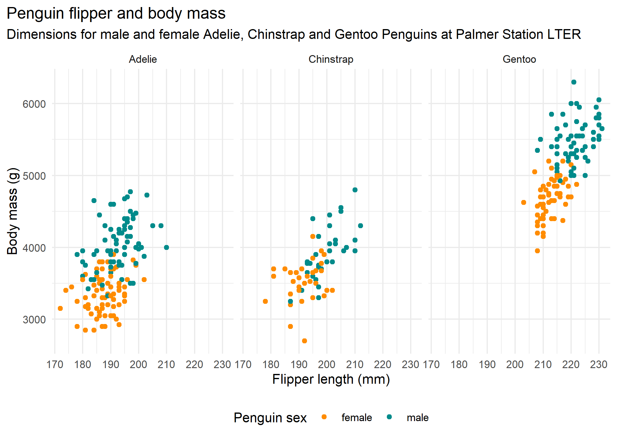
On average, male penguins seem to be heavier than female ones, and this is consistent along all three species.
Simpson’s Paradox: Penguin bill length vs bill depth
In the original scatterplot matrix without species, the lowest correlation coefficient of -0.235 was between bill length and bill depth. The following is just the scatterplot with the line of best fit added.
bill_no_species <- ggplot(data = penguins,
                         aes(x = bill_length_mm,
                             y = bill_depth_mm)) +
  geom_point() +
  theme_minimal() +
  scale_color_manual(values = c("darkorange","purple","cyan4")) +
  labs(title = "Penguin bill dimensions (omit species)",
       subtitle = "Palmer Station LTER",
       x = "Bill length (mm)",
       y = "Bill depth (mm)") +
  theme(plot.title.position = "plot",
        plot.caption = element_text(hjust = 0, face= "italic"),
        plot.caption.position = "plot") +
  geom_smooth(method = "lm", se = FALSE, color = "blue")

bill_no_species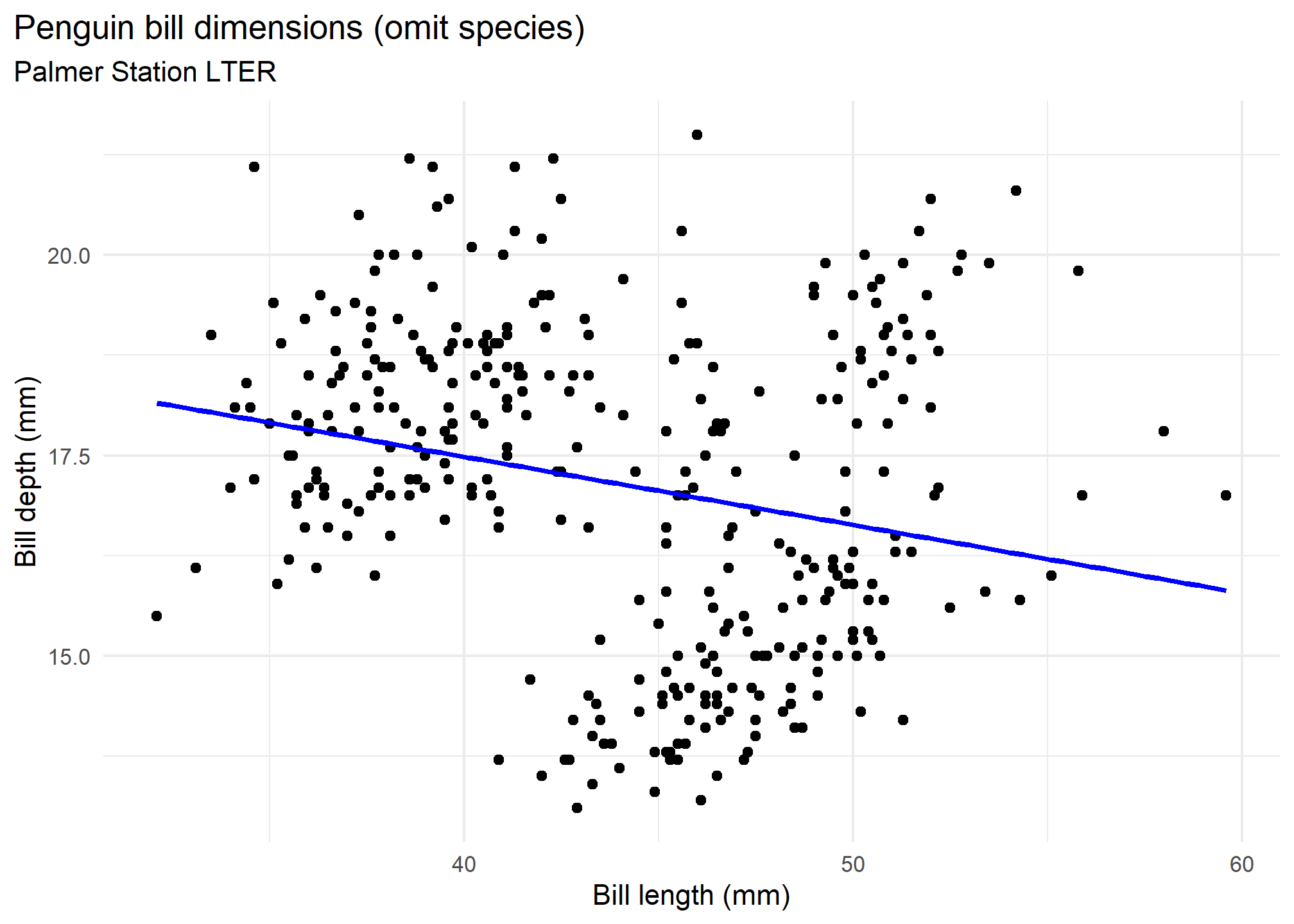
However, if we plot the same scatterplot colouring points by species, we get a completely different story.
bill_len_dep <- ggplot(data = penguins,
                         aes(x = bill_length_mm,
                             y = bill_depth_mm,
                             group = species)) +
  geom_point(aes(colour = species,
                 shape = species),
             size = 3,
             alpha = 0.8) +
  geom_smooth(method = "lm", se = FALSE, aes(colour = species)) +
  theme_minimal() +
  scale_color_manual(values = c("darkorange","purple","cyan4")) +
  labs(title = "Penguin bill dimensions",
       subtitle = "Bill length and depth for Adelie, Chinstrap and Gentoo Penguins at Palmer Station LTER",
       x = "Bill length (mm)",
       y = "Bill depth (mm)",
       color = "Penguin species",
       shape = "Penguin species") +
  theme(legend.position = c(0.85, 0.10),
        legend.background = element_rect(fill = "white", color = NA),
        plot.title.position = "plot",
        plot.caption = element_text(hjust = 0, face= "italic"),
        plot.caption.position = "plot")

bill_len_dep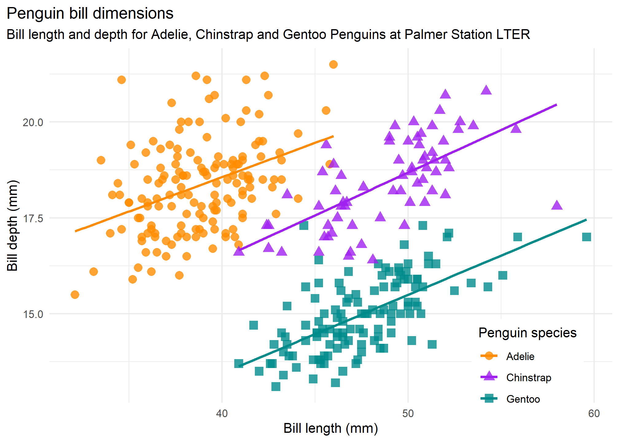
Is Y heavily skewed? Does it need to be transformed?
THe variable we are interested to explain, body mass, does not appear to be heavily skewed so there is no need for any transformation.
Acknowledgements
- This page is adapted from the Palmer Palmer Penguins package Vignette